Indoor Paint Color Ideas, 25 Things You Should Know
Are you looking to refresh your living space or bored with your interior design? Look no further; we have the right indoor paint color ideas to transform your home and elevate your mood. With our years of experience and an eye for design, we are confident that we can help you create the perfect atmosphere by finding the ideal colors that match your style and complement the vibe of your home.
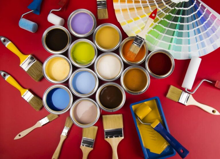
Indoor paint color ideas:
Indoor paint color ideas play a crucial role in brightening up spaces and enhancing the overall aesthetic of a room. Some popular choices include neutrals like gray, beige, and white for elegance and versatility, earth tones like greens, browns, and terra cotta for a natural feel, and bold hues like blue, red, and yellow for a striking statement. Factors like room function, lighting, and color psychology should be considered during selection.

Discover a world of inspiration for your interior walls with our collection of unique and stylish indoor paint color ideas. Transform any room with ease, creating a fresh and inviting atmosphere. Read on to explore our variety of suggestions and unleash your inner designer!
Contents
- 1 Creative Color Schemes for Interior Spaces
- 2 Top Trending Interior Wall Hues Revealed
- 3 The New Color Trend Taking Over Gray
- 4 Warm and Inviting Paint Colors for Your Home
- 5 The Happiest Color to Paint a Room
- 5.1 • Colors and Emotions: The Science Behind It
- 5.2 • Yellow: The Color of Sunshine and Happiness
- 5.3 • Green: The Power of Nature and Serenity
- 5.4 • Blue: The Serenity of Sky and Sea
- 5.5 • Orange: Vibrancy and Energy
- 5.6 • The Power of Personal Preference
- 5.7 • The Power of Color Combinations
- 5.8 • Test and Decide
- 5.9 • The Bottom Line
Creative Color Schemes for Interior Spaces
• Adding Life to Your Walls
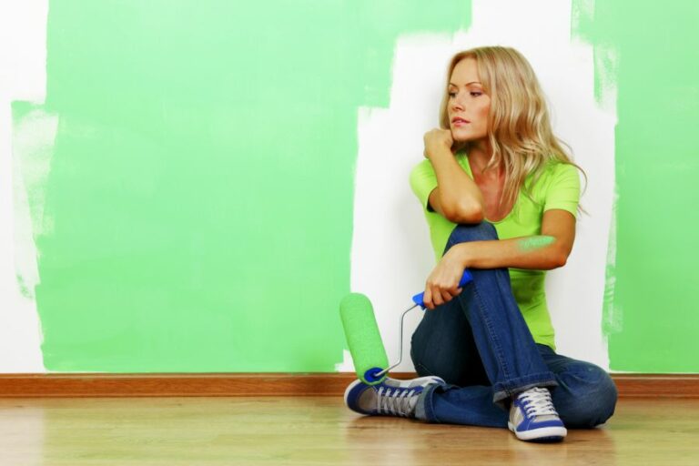
Indoor paint color ideas are essential for brightening up spaces and transforming the overall aesthetic of a room. No matter the size or style of your home, the right paint color can make all the difference in how it feels and looks.
From neutrals to bold blues, the options are endless when it comes to selecting the perfect shade.
• Neutrals: The Timeless Choice
Neutral colors are often associated with elegance and sophistication, making them an ideal choice for those seeking a versatile yet classic look. Some of the most popular neutral paint colors include:
- Gray: A true design chameleon, gray can be warm or cool, fanciful or conservative, depending on the shade you choose. From deep charcoal to pale dove, the possibilities for pairing gray with other colors are endless. The Spruce offers a list of gray paint colors that can serve as a starting point in your search.
- Beige: This calming color can range from light sand to rich caramel, offering a warm, inviting atmosphere in any room. Beige pairs well with a variety of furniture and design styles, making it a popular choice for homeowners. Better Homes & Gardens has a helpful guide to beige paint colors for further inspiration.
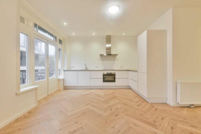
- White: A crisp, clean choice for any room, white paint can make a space feel larger and brighter. Opt for warmer tones to create a cozy ambiance, or stick with cooler shades for a modern touch. Benjamin Moore’s top white paint colors are excellent choices for those seeking a timeless look.
• Earth Tones: Bringing Nature Indoors
Earth tones can provide a serene, organic feel to your home. These shades, inspired by nature, are wonderful for grounding a space and adding warmth. Some popular earth-tone paint color ideas include:
- Greens: From deep forest greens to light sage, this color family can bring an element of nature to any space. Green works well in almost any room, especially when paired with warm neutrals or rich, earthy browns.
- Browns: Deep browns can add a sense of coziness to a space, while lighter shades offer a subtle warmth. Chocolate browns, taupe, and other earthy hues are suitable for both traditional and contemporary homes.
- Terra cotta: This burnt orange hue is associated with warmth and earthiness. Terra cotta is best suited for living spaces and bedrooms, where it can foster a relaxing environment.
• Bold Colors: Making a Statement
If you’re looking to make a powerful impression, bold colors might be the way to go. These vibrant hues can transform the energy and aesthetic of a room instantly. Here are some bold color options to consider:
- Blue: A deep navy or vivid turquoise can create a dramatic effect that still feels sophisticated. Blue is known for its calming properties, making it a popular option for bedrooms and living spaces.
- Red: This powerful color can evoke feelings of warmth, passion, and energy. While it might not be the best choice for a bedroom, a bold red can make a statement in a dining room or living area.
- Yellow: A bright, cheerful color, yellow can immediately uplift the mood of any room. In small doses or on an accent wall, this hue can add a pop of personality to your space.
• Tips for Successful Color Selection
Choosing the perfect paint color for your home can be a daunting task, but keeping the following tips in mind can help guide your decision:
- Consider the room’s function: The purpose of the space can play a significant role in color selection. For instance, opt for calming colors in bedrooms, while bright and energetic hues might be more appropriate for living spaces.
- Take into account lighting: Both natural and artificial lighting can affect how a paint color appears in a room. It’s always a good idea to test samples on your walls at different times of the day to ensure you’ll be satisfied with the final result.
- Use color psychology: Colors can evoke certain feelings and emotions, so consider how you want your space to feel when selecting a paint color. For example, blues are known for their calming properties, while reds can stimulate conversation and appetite.
- Don’t be afraid to experiment: If you’re unsure about a color, try painting a small section of your wall or using removable wallpaper to test the look before committing.
With a vast array of indoor paint color ideas available, the possibilities are endless for transforming your home interior. Whether you opt for a classic neutral, earthy tone, or a bold statement hue, the right paint color can create the perfect ambiance in any space.
Color | Type of Room | Feeling/Atmosphere |
|---|---|---|
Soft Gray | Living Room | Relaxing, Calming |
Light Blue | Bedroom | Soothing, Peaceful |
Off-White | Kitchen | Bright, Clean |
Green | Home Office | Productive, Nature-inspired |
Yellow | Dining Room | Warm, Inviting |
Blush Pink | Nursery | Soft, Nurturing |
Top Trending Interior Wall Hues Revealed
When considering a new look for your home’s interior walls, you might be wondering: What is the most popular color? Choosing a color for your walls is no trivial decision. The color you pick can dramatically affect the atmosphere and overall feel of a room.
• Classic Neutrals: White, Gray, and Beige
Neutral colors are timeless and versatile, which is why they continue to be top choices for interior walls. Here are three popular neutral options:
– White Walls: Crisp and Clean
White is possibly the most popular color for interior walls, primarily because of its simplicity, versatility, and ability to make a room feel more spacious. With its clean and crisp appearance, white pairs well with almost any color.
Additionally, white walls are an excellent backdrop for showcasing artwork or other decorative accents in a room.
According to a study conducted by Zillow, a leading online real estate marketplace, homes with white walls sold for more than those with darker colors (source). This finding suggests that many homebuyers prefer white walls and appreciate their stylistic flexibility.
– Gray Walls: Cool and Contemporary
Gray is another popular neutral color for interior walls. This hue has gained popularity in recent years, partially due to the rise of Scandi-chic and minimalist design trends. Gray offers an updated look while still providing the versatility that neutrals are known for.
Depending on the undertones, gray can range from cool with blue or green undertones to warm with brown or reddish undertones. This variety allows homeowners to easily find a gray that complements their existing furnishings and decor.
– Beige Walls: Warm and Inviting
For those who prefer a warmer, cozier atmosphere, beige remains a popular choice for interior walls. Beige offers a perfect balance between white and brown, resulting in a comforting and inviting feel. Like gray, beige comes in various undertones, making it adaptable to many interior styles.
• Earth Tones: Natural and Soothing
Earth tones, derived from the colors found in nature, are also popular for interior walls. These hues evoke a sense of serenity and can create a calming environment.
– Sage Green: Earthy and Tranquil
Sage green is a soft, muted green that adds an earthy touch to any room. It has a calming effect, making it a popular choice for bedrooms, living rooms, or any area where relaxation is the goal. Sage green pairs well with natural materials like wood and stone, enhancing a room’s connection to the outdoors.
– Terracotta: Rustic and Warm
Terracotta, a warm reddish-brown, also draws its inspiration from nature. The hue evokes the warmth of sun-baked clay, making it an inviting color for interior walls. This color works best in spaces with abundant natural light and is often found in Southwestern or Mediterranean-inspired homes.
• Bold and Vibrant: Make a Statement
While neutral and earthy tones remain popular choices, bold colors can be perfect for those who want to make a statement. When using vivid color, it’s essential to approach the design thoughtfully to ensure the hue doesn’t overpower the space.
Navy blue walls add depth, sophistication, and richness to a room. This darker hue is ideal for creating a cozy atmosphere, working especially well in home offices or dining rooms.
Because navy blue is so deep, it’s essential to balance the color with lighter furnishings and accessories or risk making the space feel too dark.
– Mustard Yellow: Bold and Energizing
A mustard yellow accent wall can inject energy and excitement into a room. This warm, bold hue works well in spaces like kitchens or living rooms and pairs beautifully with navy blue or gray for a contemporary look.
• Final Thoughts and Recommendations
When choosing the most popular color for your interior walls, it’s crucial to consider your personal style and how the hue will impact the overall aesthetic of your space.
Whether you opt for a classic neutral, soothing earth tone or bold statement color, make sure the choice feels authentic to your personality and enhances the room’s design.
Remember that experimenting with paint is a low risk since you can easily repaint a wall if you’re unhappy with your initial choice. Most importantly, have fun exploring different colors and trust your instincts in finding the perfect hue for your home.
The New Color Trend Taking Over Gray
In recent years, gray has been the undisputed champion of interior design, hailed as a sleek and sophisticated hue suitable for every room.
But as interior design trends evolve, we’ve begun to see a new contender step in to take gray’s place as the most popular, versatile color for both residential and commercial spaces.
• Say Hello to Beige and Greige
One new color trend that is beginning to replace gray is beige. This warm neutral has been making a comeback for a while, but recently it’s begun to win over the hearts of both experts and homeowners.
Beige offers an unmistakable warmth and sense of coziness that gray, for all its sophistication, can’t quite provide.
In addition to beige, designers are embracing “greige,” a combination of gray and beige. This color is increasingly viewed as a way to gracefully transition from gray to warm neutrals in interior design.
Greige is a versatile hue that combines the best of both worlds: the elegance of gray and the inviting warmth of beige.
To get an expert take on the resurgence of beige and greige, I recommend visiting Sherwin-Williams. Their expert insight and advice on incorporating these hues into your space will prove invaluable.
• Earth Tones for the Win
Earth tones are making their way to the forefront of design trends. These colors are directly inspired by nature, adding warmth, richness, and an organic feel to interiors. As more people become interested in sustainable and eco-friendly design, the appeal of earth tones continues to rise.
Some earth tones that are successfully replacing gray include:
- Terracotta
- Sienna
- Burnt Umber
- Olive Green
These colors create a warm and welcoming atmosphere while providing a sense of unity with nature. I recommend experimenting with earth tones through the use of accent pieces, textiles, and finishes.
As an alternative to gray, interior designers are looking to navy blue as a deep, sophisticated option. This shade creates a sense of luxury and depth while remaining versatile and easy to blend with other colors.
Navy blue can be used to create a bold and dramatic impact or be paired with softer tones for a more refined look.
For those interested in incorporating navy blue into their design, I suggest starting with small steps; introducing this shade through accessories, such as pillows, throws, or artwork. This will ensure that the richness of navy blue complements, rather than overwhelms, your space.
• The Power of Green in Design
Green, in its various shades, is becoming a popular choice for those looking for a fresh alternative to gray.
From soft sage to deep emerald, this hue brings life, energy, and balance to any room. In addition to representing growth and renewal, green is also a calming color that can help create a tranquil and serene atmosphere.
I recommend trying out different shades of green to see which one works best within your space and pairing green with wooden accents or other organic elements to enhance its earthy appeal.
• The Future of Color in Design
As design trends shift and evolve, we can expect to see a growing emphasis on color as a way to create spaces that are not only aesthetically pleasing but also have a positive impact on our well-being.
The popularity of earth tones and greens, in particular, highlights a desire for more sustainable and eco-conscious interior design.
Though gray will undoubtedly remain a classic choice, the rise of these new color trends offers a fresh and exciting opportunity to transform your space.
Whether you decide to experiment with beige, greige, earth tones, navy blue, or green, the possibilities for creating a stunning and inviting environment are endless.
Warm and Inviting Paint Colors for Your Home
Creating a cozy atmosphere in your home begins with choosing the right paint colors. The colors you select for your walls play a significant role in evoking a certain mood or ambiance.
• Warm, Earthy Tones for a Natural Retreat
Earthy tones can create a sense of comfort and connection to the outdoors, making your living spaces feel more grounded and tranquil. Some earthy shades to consider include:
- Terracotta: This warm, reddish-brown hue is reminiscent of clay pots and southwestern landscapes. It works well in living rooms or dining areas where you want to encourage conversation and relaxation. Learn more about the color terracotta in-depth from this academic article.
- Olive green: A muted, earthy green that brings to mind peaceful forests, olive green is perfect for creating a serene and calming atmosphere. It pairs beautifully with natural materials like wood and stone, making it a winning choice for kitchens and bathrooms.
- Taupe: A versatile neutral, taupe is a warm and inviting color that pairs well with a wide range of other hues. It’s a fantastic choice for any room in need of a cozy yet sophisticated touch.
• Soft, Pastel Shades for a Soothing Escape
Pastel shades are gentle and soothing, creating an ideal backdrop for relaxation and rejuvenation. Some popular pastel paint colors include:
- Powder blue: A soft, airy shade of blue, this paint color works wonders in bedrooms, bathrooms, and other living spaces where you want a feeling of lightness and tranquility.
- Blush pink: This delicate, rosy hue is a refined alternative to more traditional pinks. It infuses any space with a touch of romance and femininity, making it an excellent choice for bedrooms and bathrooms.
- Lavender: With its calming properties, lavender is a lovely choice for bedrooms or home offices. It pairs well with crisp whites and other pastel shades, creating a soothing environment that encourages rest and reflection.
• Rich, Deep Hues for a Luxurious Hideaway
Deep, rich colors can evoke feelings of luxury and sophistication while still maintaining an inviting ambiance. Consider these bold paint choices for a more opulent touch:
- Navy blue: A timeless and versatile shade, navy blue adds depth and elegance to living rooms, bedrooms, and even bathrooms. Pair it with crisp white trim and metallic accents for a chic, polished look.
- Burgundy: This deep red hue is perfect for adding warmth and drama to living and dining spaces. It works particularly well when contrasted with lighter wood or neutral furnishings.
- Emerald green: This bold, jewel-toned green adds richness and sophistication to any room. Combine it with gold accents and dark wood furniture for an opulent and luxurious feel.
• Neutrals with Warm Undertones for a Classic, Comfortable Space
Neutral paint colors are a popular choice for fostering a cozy atmosphere in any room. Look for neutrals with warm undertones to create the most inviting spaces:
- Cream: A soft, warm white that feels more welcoming than a stark, cool-toned option. Use cream in any room where you want a subdued, comfortable vibe.
- Beige: A tried-and-true classic, beige works well in any room and pairs seamlessly with a variety of other colors. Opt for warmer shades that have undertones of gold or peach for a truly cozy atmosphere.
- Greige: A trendy blend of gray and beige, greige is a sophisticated choice for those who want a neutral paint color with added depth. Look for warm, earthy greiges to create the coziest environment.
• Tips for Incorporating Cozy Paint Colors in Your Home
- When selecting cozy paint colors, consider the size of your room and the amount of natural light it receives. Light colors will generally make the space feel larger and brighter, while darker hues can add depth and warmth.
- In open-concept areas, maintain a cohesive flow by using different shades of the same color or selecting colors that coordinate well with one another.
- Don’t be afraid to mix warm and cool tones within the same room. This can create an interesting, dynamic atmosphere that feels both cozy and visually stimulating.
In conclusion, the key to choosing cozy paint colors for your home is to focus on warm, earthy tones, soft pastels, and neutrals with warm undertones. These hues can transform your living space into a warm, inviting retreat where you and your loved ones can relax, unwind, and enjoy each other’s company.
The Happiest Color to Paint a Room
Choosing the right color for your room can significantly influence your mood and overall well-being. Numerous studies have shown that particular shades of color can evoke a sense of happiness and uplifting energy.
• Colors and Emotions: The Science Behind It
Colors have the power to elicit emotions and set the mood of a space. A study conducted by The American Psychological Association found that color can affect our behavior, mood, and even physiological reactions.
Understanding the psychological effects of color is essential when selecting the best hue to paint your room.
• Yellow: The Color of Sunshine and Happiness
Yellow is often recognized as the happiest color due to its strong association with sunshine and warmth, making it an excellent choice for any room.
The connection between the color yellow and happiness is deeply rooted in our psychology, as researchers suggest that our brains are hardwired to associate yellow with positive feelings and energy. Moreover, yellow is an attention-grabbing color that can brighten a room and make it feel more inviting.
• Green: The Power of Nature and Serenity
Another color that has been shown to generate happiness is green. Green is often associated with nature and can evoke a sense of calm and tranquility. A study from the University of Melbourne found that exposure to green outdoor spaces led to improved mental health and overall happiness.
Painting your room green can bring the calming effect of nature indoors, making it an excellent choice for stress relief.
• Blue: The Serenity of Sky and Sea
Blue is a popular color choice for bedrooms and bathrooms, as it is often associated with calmness and serenity.
A study by Pantone Color Institute, explains that blue may reduce blood pressure and heart rate due to its soothing effects. Incorporating the color blue in your living space can create a relaxing atmosphere and contribute to feelings of happiness and contentment.
• Orange: Vibrancy and Energy
Orange is an invigorating and uplifting color that symbolizes happiness, enthusiasm, and energy. It is an excellent choice if you want to create a lively and vibrant atmosphere in your room.
Unlike blue and green, which promote relaxation, orange can stimulate activity and energy, making it ideal for social spaces such as living rooms or kitchens.
• The Power of Personal Preference
Although certain colors may have a general association with happiness, it is essential to consider personal preferences when choosing the color for your room. Individual experiences and associations with specific colors may create a unique emotional response.
Therefore, the happiest color for one person may not be the same for someone else.
• The Power of Color Combinations
Experimenting with color combinations can also amplify the happiness factor in a room. Pairing complementary colors or using different shades and tones of the same color can create a sense of harmony and balance.
For example, combining yellow with a soft shade of gray or mixing blue with a warm beige can make your space aesthetically pleasing and contribute to feelings of happiness.
• Test and Decide
Before committing to a specific color for your room, it’s useful to test your selected color with swatches or small paint samples. Painting a small section on the wall will give you a better idea of how the color will look in the space and under different lighting conditions.
Once you have tested and compared different color options, you can decide on the best shade to paint your room.
• The Bottom Line
There is no one-size-fits-all answer to the question, “What is the happiest color to paint a room?” It’s essential to consider the psychological effects of colors, your personal preferences, and the purpose of the space when selecting a shade that will evoke happiness.
Whether it’s the cheerful energy of yellow, the calming serenity of green, the soothing effects of blue, or the vibrant liveliness of orange, selecting a color that resonates with you can lead to a room that instills feelings of happiness and well-being.