Top Indoor Paint Color Combos, 25 Things You Should Know
Choosing the perfect indoor paint color combination can feel daunting, but it’s essential in creating a visually appealing and inviting space. Luckily, we’re here to help guide you through the process and share our knowledge of the top paint color combos that will elevate the look and feel of your home. With our expertise, you can confidently select the perfect palette and create a stunning, cohesive design that reflects your style and enhances any room.
Top indoor paint color combos:
Top indoor paint color combos include classic neutrals like gray and white, beige and cream, taupe and ivory; earthy tones like olive green and off-white, terracotta and beige, slate blue and sand; bold and vibrant combinations like navy blue and white, emerald green and soft gray, teal and mustard; and monochromatic schemes with varying shades of gray, blue or white.

Ready to revamp your interior space with a fresh coat of paint? Keep reading to discover the top indoor paint color combos that’ll breathe new life into your home. From harmonious hues to bold contrasts, we’ve got plenty of inspiration waiting for you!
Contents
- 1 Best Interior Paint Color Pairings
- 2 Ideal Color Schemes for Home Interiors
- 3 Top 3 Complementary Color Pairings
- 4 Two Perfect Colors That Pair Well
- 5 Harmonious Paint Color Combinations
Best Interior Paint Color Pairings
Creating the perfect color palette for your home can be a fun and exciting project, but it can also be a daunting task with the wide array of color options available.
Selecting complementary paint colors can help create an appealing flow between different rooms in your home, enhance the aesthetics of a particular room, and improve your overall interior design.
• Classic Neutrals
Neutral colors have always been a popular choice for interior paint, as they can create a calm and sophisticated atmosphere while also providing a versatile backdrop for various furniture and accessories. Some recommended color combinations in this category include:
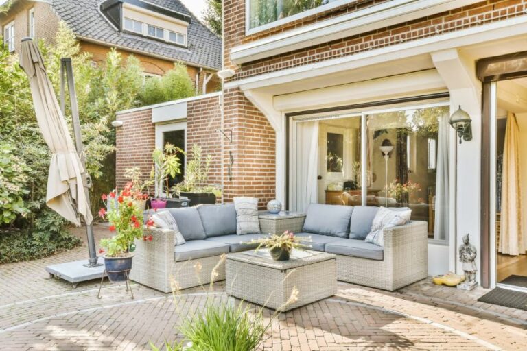
- Gray and White: A timeless pairing, gray and white can create a clean, modern look in your home. For a soft and elegant feel, consider combining light gray walls with crisp white trim and ceiling. Benjamin Moore’s Gray Owl is a popular choice for a gentle gray tone.
- Beige and Cream: Warm and cozy, beige walls paired with cream trim can create a relaxing atmosphere in your living areas. A combination such as Sherwin-Williams Accessible Beige and Creamy will feel inviting and can easily work with many types of furniture and decor.
- Taupe and Ivory: For a refined and elegant space, consider a taupe-and-ivory combo. A subtle taupe, like Benjamin Moore’s Edgecomb Gray, paired with soft ivory, will create a sophisticated and warm ambiance in any room.
• Earthy Tones
Drawing inspiration from nature, earthy tones can bring a sense of warmth and comfort to your home. Here are a few popular earthy color combinations:
- Olive Green and Off-White: Olive green walls can add depth and character to a room, and when paired with a neutral off-white trim, it creates a pleasing and harmonious look. Consider Farrow & Ball’s Cooking Apple Green and Slipper Satin for this natural, earthy combo.
- Terracotta and Beige: Terracotta walls invoke a warm and cozy ambiance, and when combined with beige trim, it creates a lovely, welcoming space. Try pairing Benjamin Moore’s Adobe Dust with a light beige, such as Manchester Tan, for a balanced, warm effect.
- Slate Blue and Sand: For a serene, coastal-inspired atmosphere, consider pairing a soft slate blue with a sandy beige. Sherwin-Williams’ Sea Salt and Nomadic Desert create a calming and fresh combination, perfect for a tranquil bedroom or relaxing living area.
• Bold and Vibrant
If you are looking for a more bold and dynamic color scheme, consider incorporating some of these vibrant color combinations into your home:
- Navy Blue and White: A classic and timeless pairing, navy blue walls can create a dramatic yet elegant statement in any room. Combine this bold color, such as Sherwin-Williams Naval, with a crisp white trim for a striking look that never goes out of style.
- Emerald Green and Soft Gray: For a rich, jewel-toned look, consider painting your walls in a deep emerald green. Pair it with a soft gray trim to create a balanced and sophisticated appearance. Benjamin Moore’s Emerald Isle and Gray Cloud make an excellent pair.
- Teal and Mustard: For a more playful and energetic space, consider pairing a vibrant teal with a warm mustard-yellow trim. This combo can evoke a lively, creative atmosphere that is particularly suitable for a home office or children’s playroom. Try Behr’s Mermaid Net and English Daisy for a unique and exciting color combination.
• Monochromatic Magic
For a more cohesive and elegant look, you may wish to consider monochromatic color schemes. These involve selecting one color and using various shades or tones throughout the room. Some notable monochromatic color combos include:
- Gorgeous Grays: For a modern and polished space, consider varying shades of gray. You can experiment with lighter shades on the walls and darker shades for the trim or vice versa. Look into Benjamin Moore’s Stonington Gray paired with Chelsea Gray for a sleek and sophisticated atmosphere.
- Blissful Blues: Create a peaceful and soothing environment by choosing different shades of blue. Pair a light blue, such as Sherwin-Williams’ Misty, with a darker hue for the trim, like Indigo Batik, for a balanced and harmonious look.
- Wonderful Whites: For a clean, minimalist aesthetic, consider an all-white color scheme. Opt for varying shades of white to add subtle depth and dimension to the room. Farrow & Ball’s All White and Wevet make an excellent combo for a serene, light-filled space.
In conclusion, selecting the perfect indoor paint color combos can greatly enhance your home’s overall ambiance and aesthetic. By considering your personal preferences and the desired atmosphere for each room, you can create a harmonious and inviting living space that truly reflects your style.
Don’t be afraid to experiment with different color combinations and find the perfect palette that speaks to you!
Color Combo | Description |
|---|---|
Gray and Blue | A calming and sophisticated combination that works well in bedrooms and living rooms. |
White and Soft Pink | A lovely color combo perfect for nurseries or soft and light living spaces. |
Green and Beige | A harmonious and natural combo that brings the feeling of the outdoors into your home. |
Yellow and Gray | A bright and modern combination that adds a cheerful pop of color to any room. |
Black and White | A classic and timeless color combo that adds sophistication and bold contrast to any room. |
Navy and Gold | A rich and luxurious combo that works well in both traditional and contemporary spaces. |
Orange and Brown | A warm and inviting color combo that adds depth and character to any living space. |
Purple and Gray | A modern and elegant combination that adds a chic touch to bedrooms and living spaces. |
Red and White | A bold and eye-catching combination that adds energy and excitement to any room. |
Turquoise and Lime Green | A vibrant and playful combination that creates a fun and lively atmosphere in any space. |
Ideal Color Schemes for Home Interiors
When it comes to choosing the perfect color combination for your house interior, there are seemingly endless options. However, by considering current trends, the psychology of colors, and the functionality of each space, you can create a beautifully designed home.
• The Role of Color in Interior Design
Color plays a significant role in setting the mood of a space, influencing our perception and emotions. Warm colors tend to evoke a sense of comfort and intimacy, while cool colors are calming and serene.
By understanding the characteristics of different colors, you can create an ideal atmosphere tailored to each room’s function.
For more information on the psychology of colors, visit Color Matters, an educational resource.
• Timeless Color Combinations
While trends may come and go, certain color combinations never go out of style. These classic pairings can be adapted to various design styles, making them a versatile choice for your interior.
– Black and White
A black and white color combination is definitive, sophisticated, and timeless in its simplicity. This high-contrast scheme can be modified by varying the proportions of black-and-white elements.
For a minimalist look, use predominantly white space with black accents or vice versa for a more dramatic effect.
– Grey and White
Grey and white are a classic combination for a modern and elegant design. Grey conveys an understated elegance, while white brings brightness and freshness. Using various shades of grey can add depth and interest to a room. Combine this palette with touches of vibrant colors for an energetic feel.
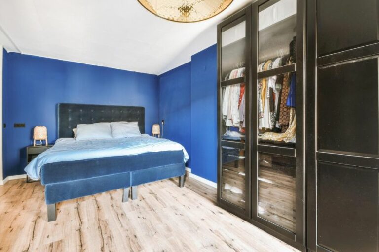
– Blue and White
Blue and white is a classic combination that exudes a clean, coastal charm. This combination can be adapted to various design styles, from traditional to modern. Consider using different shades of blue to create a calming atmosphere that promotes relaxation.
• Bold Color Combinations
For those looking to make a statement, bold color combinations can be both energizing and inspiring. These pairings often involve strong contrasts and rich colors, giving a room a distinctive character.
– Emerald Green and Gold
Emerald green and gold is a luxurious and opulent combination that can evoke a sense of glamour. The deep green tones can be balanced with lighter, neutral shades to prevent the space from feeling overwhelming.
Coral and navy blue is a striking combination that creates a modern and lively atmosphere. This pairing works exceptionally well in living rooms and bedrooms, where a vibrant ambiance is desired.
– Mustard Yellow and Charcoal Grey
Mustard yellow and charcoal grey is a bold and sophisticated choice that adds warmth to a space. This color combination works well in cozy spaces like living rooms and bedrooms, where comfort and relaxation are key.
• Creating a Cohesive Color Scheme
Consider the overall flow and cohesion between rooms when selecting color combinations for your house interior. Using colors from the same family or repeating fundamental elements can create a harmonious atmosphere throughout your home.
– Monochromatic Color Scheme
One approach to creating a cohesive scheme is to use a monochromatic palette. By utilizing different shades and tints of a single color, you can create depth and interest while maintaining cohesion. This approach is particularly suitable for smaller spaces, as it can create a sense of continuity.
– Complementary Color Scheme
Another strategy is to use complementary colors, which are colors that sit opposite each other on the color wheel. This approach creates contrast and balance, making it an effective way to add visual interest. By using various shades of the chosen colors, a more dynamic and harmonious space can be created.
– Transitional Color Scheme
A transitional color scheme involves gradually transitioning from one color to another across multiple rooms. Using this approach can create a sense of flow and continuity, guiding users from one space to another.
In conclusion, the best color combination for your house interior depends on personal preference, the desired atmosphere, and the function of each space.
Referencing the recommendations above and considering the impact of color on our emotions can guide you in selecting the perfect palette for your home. Remember to consider trend longevity and maintain cohesion throughout your house for a stylish and harmonious interior.
Combination Name | Colors Involved |
|---|---|
Classic Contrast | White and Black |
Monochromatic Serenity | Shades of Blue |
Warm Earth Tones | Browns, Beige, and Cream |
Colorful Harmony | Green, Yellow, and Cream |
Soft Pastels | Pastel Pink, Blue, and Green |
Modern Chic | Grey, White, and Yellow |
Top 3 Complementary Color Pairings
• Introduction to Color Theory
Color is an essential element in design, fashion, and visual arts. Understanding color theory and how colors work together can create harmonious and eye-catching combinations. To dive deep into color theory, one can explore resources like Pantone, an industry-standard authority on color.
• Understanding Components of Colors That Go Together
When selecting the three best colors that go together, it is pivotal to consider the aspects of color harmony, contrast, and balance. The following sections will delve into each of these components.
– Color Harmony
Color harmony refers to a visually appealing arrangement of colors. The color wheel, developed by Sir Isaac Newton, is a helpful tool for identifying harmonious color combinations.
Generally, colors that are adjacent, opposite, or equidistant to each other on the color wheel are considered harmonious. Three widely recognized color schemes that create harmony are triadic, analogous, and complementary.
– Contrast and Balance
Contrast and balance play a crucial role in determining the most suitable color combinations. High-contrast colors create a striking and vibrant look, whereas low-contrast colors produce a softer, more subtle look. Striking the right balance will depend on the desired aesthetic and usage of the colors.
• The Three Best Color Combinations According to an Expert
Based on the principles of color harmony, contrast, and balance shared previously, the following combinations are my top picks for the three best colors that go together seamlessly.
1. The Triadic Color Scheme: Blue, Red, and Yellow
Triadic color schemes consist of equidistant colors from the color wheel. The primary colors, blue, red, and yellow, are a classic example. These combinations offer strong contrast while maintaining harmony.
A good tip for balancing this color combination is to let one color dominate while the other two serve as accents. For instance, using blue as the dominant color can create a cool and calming atmosphere, while red and yellow accents can add warmth and energy.
2. The Analogous Color Scheme: Green, Blue, and Purple
An analogous color scheme involves colors that are adjacent to each other on the color wheel. A combination of green, blue, and purple is an outstanding example of a harmonious analogous color scheme. This combination evokes a sense of tranquility and cohesiveness.
When using these colors, one effective approach is to vary the intensity of the colors, such as using a vibrant green, a soft blue, and a medium purple. The variations in color intensities can introduce contrast and balance in the scheme.
3. The Complementary Color Scheme: Orange, Purple, and Green
Complementary color schemes feature colors that are opposite each other on the color wheel. Adding a third color that is equidistant creates a dynamic combination. One such combination is orange, purple, and green.
This color trio offers a high degree of contrast and can deliver a vibrant, energetic look. Similar to the triadic color scheme, it is advised to designate one color as the dominant hue and use the other two colors as accents to produce a balanced and visually appealing result.
• Conclusion
Identifying the best color combinations ultimately relies on understanding color theory, harmony, contrast, and balance. The expert-recommended trios of blue, red, and yellow; green, blue, and purple; and orange, purple, and green are excellent starting points.
Remember to adjust the intensity and balance of the colors to achieve the desired aesthetic. By experimenting and applying these guiding principles, one can create limitless stunning color combinations.
Two Perfect Colors That Pair Well
In the world of design and aesthetics, the act of choosing the perfect color combination can elevate any creation to new heights. Out of countless possible pairs, I believe the two best colors that go together are blue and green.
Whether it is for interior design, fashion, graphic design, or just in nature, blue and green harmoniously blend to create a striking and soothing palette that is universally appealing.
• The Science Behind Blue and Green
Before getting into the practical applications, it’s essential to understand why these two colors work so well together. Blue and green are adjacent colors on the color wheel, making them a natural fit. When colors are next to each other on the wheel, they are referred to as analogous colors.
The close relationship of analogous colors ensures a seamless transition between the shades, and they can often evoke an overall calming effect.
• Nature’s Favorite Combo
One of the primary reasons blue and green work so well together is their abundant presence in our natural world. Think lush forests, vast stretches of grassy fields contrasted with the deep blue of the sky, or the serene ocean waves and green landscapes meeting the horizon.
This color pair is ingrained in our minds as a representation of life, harmony, and tranquility.
The prevalence of blue and green in nature may explain our ability to perceive more shades of these colors than any other. This higher sensitivity to blue and green hues results in countless opportunities for creative pairing between different shades and tints, creating stunning effects while maintaining a pleasing harmony.
• Bringing Blue and Green Indoors
In interior design, the combination of blue and green evokes a fresh, vibrant, and relaxing mood. This color duo lends itself to creating an inviting, calming atmosphere that can transform any room. Here are some ways to introduce blue and green combinations into your home:
– Walls and Decor
Creating an alluring and cohesive room can be achieved by pairing blue and green on walls, furniture, and decor accessories. For instance, pairing a rich navy blue with a lively emerald green creates a sophisticated and luxurious ambiance.
Consider painting walls in a soft, muted blue or green hue, then adding striking accents to the room in corresponding shades using furniture, artwork, or rugs. Mixing different shades and textures will add depth and interest to the space.
– Kitchen and Bath
Blue and green in kitchens and bathrooms evoke a sense of cleanliness and serenity. Introduce these colors with cabinetry, backsplashes, or bathroom fixtures. A subtle combination of a pale blue wall and soft mint green tiles is particularly stunning, creating a soft and dreamy atmosphere.
• A Stylish Pair in Fashion
When it comes to fashion, blue and green is a striking and versatile color combination. Elegant teal and deep navy offer a luxurious and sophisticated look, while vibrant lime green and cobalt blue lend a fresh, youthful appearance.
Clothing items that naturally combine blue and green, such as printed dresses, tops, or scarves, make the pairing effortlessly chic. Alternatively, mix and match pieces in your wardrobe, such as pairing a green blouse and a blue skirt or combining blue jeans with a green sweater.
Accessories are another excellent way to incorporate these colors into your outfit. A green handbag or pair of shoes can complement a blue dress, while jewelry in these colors can elevate any look.
• Graphic Design: The Impact of Blue and Green
In graphic design, the marriage of blue and green offers endless opportunities for visual impact. These colors can be used together in logos, website design, and promotional materials to create a cohesive, professional, and easily identifiable brand image.
Blue is often seen as a color of trust, stability, and intelligence, explaining its vast popularity among corporate brands.
Meanwhile, green is associated with growth, health, and the environment. Combining these colors allows businesses to convey a sense of reliability while also appearing innovative and conscious of sustainability initiatives.
• Final Thoughts
The pairing of blue and green is a beautiful and versatile choice across numerous applications, from nature to our everyday lives. This winning combination creates striking and appealing visuals while invoking a sense of peace and harmony.
By understanding and utilizing the potential of this color duo, you can create stunning environments, outfits, or design work that is both aesthetically pleasing and emotionally evocative.
Harmonious Paint Color Combinations
Choosing an appropriate color combination for your walls, furniture, and accessories can dramatically change the overall feel of a room.
• Understanding the Color Wheel
To begin with, it’s important to understand the concept of the color wheel, which consists of 12 main colors. There are three primary colors (red, blue, and yellow), three secondary colors (green, orange, and purple), and six tertiary colors that come from mixing primary and secondary colors.
Understanding the relationships between these colors helps identify which colors pair well together. There’s no better starting point than The Color Wheel and Color Harmony provided by Cornell University Extension.
• Monochromatic Color Scheme
A monochromatic color scheme involves selecting different shades, tones, or tints of one color. For example, in a monochromatic gray room, you can use various shades of gray on walls, furniture, and accessories.
This creates a unified, calming, and harmonious atmosphere while giving depth and visual interest to space.
Recommendation: Monochromatic schemes work well in bedrooms and living spaces where a cohesive and relaxing environment is desired.
• Analogous Color Scheme
Analogous color schemes involve selecting colors that are adjacent to each other on the color wheel. For example, blue, blue-green, and green create a natural and soothing color combination.
This scheme offers more variety and visual interest compared to monochromatic schemes without being too bold or overwhelming.
Recommendation: Analogous color schemes are great for bathrooms, kitchens, and living rooms, as they create a serene, inviting, and harmonious environment.
• Complementary Color Scheme
In a complementary color scheme, colors opposite each other on the color wheel are paired together. Examples include blue and orange or yellow and purple. This creates a high contrast, resulting in a visually exciting and stimulating space.
To avoid overwhelming a room with this scheme, consider using one color as the main focus and the other as an accent.
Recommendation: Complementary color schemes work well in children’s rooms, home offices, or any space where a lively and energizing atmosphere is desired.
• Split-Complementary Color Scheme
A split-complementary color scheme involves choosing a base color and its two neighboring colors on either side of its complement.
For example, if blue is the base color, the split-complementary pairs would be blue, red-orange, and yellow-orange. This offers a visually stimulating yet balanced color combination.
Recommendation: Split-complementary color schemes can be used in communal areas such as living rooms or dining rooms, as they create a vibrant yet harmonious environment.
• Triadic Color Scheme
A triadic color scheme consists of three colors that are evenly spaced around the color wheel. An example of this would be the combination of blue, yellow, and red. Triadic schemes offer a balance between harmony and contrast.
However, it’s essential to find the right balance between the three colors to avoid overwhelming a space.
Recommendation: Triadic color schemes can be used in kitchens, children’s rooms, or creative spaces like art studios, where a balanced and dynamic environment is desired.
• Tetradic Color Scheme
The tetradic color scheme involves selecting two sets of complementary colors. To achieve this, you pick a base color, skip two colors on the wheel, select the next one, skip two more colors, and so on. An example is blue, orange, green, and red.
This scheme offers the most vibrant and varied color combination, but it can be challenging to balance.
Recommendation: Tetradic color schemes work best in large, open spaces or commercial environments where bold and varied color combinations are desired.
In conclusion, understanding the color wheel’s relationships and various color schemes is crucial for selecting harmonious colors in any space.
From monochromatic and analogous schemes for calm environments to complementary and triadic schemes for livelier spaces, there’s a color combination to suit every taste and need.
The key to successful color selection is finding a balance between harmony and visual interest, ensuring both beauty and function in your home or workspace.