Fresher Brighter Interior Paint For Small Areas. What Pros Say
Are you tired of feeling cramped in your smaller living spaces and ready for a change? It’s time to give those areas a breath of fresh air with fresher, brighter interior paint! As experts in optimizing small interiors, we are here to help you transform your space, making it feel larger, more inviting, and full of energy.
Fresher, brighter interior paint for small areas:
To revitalize small spaces with fresh, bright interior paint, choose light and neutral colors, invest in high-quality paints such as water-based latex or acrylic, and use proper preparation techniques. Additionally, use high-quality painting tools, apply expert techniques, and maintain the newly painted space to ensure a visually expanding and long-lasting result.

Discover the secrets to making small spaces feel larger and more inviting with our fresher, brighter interior paint ideas! Keep reading to unveil top color choices, tips, and tricks to enhance your home’s aesthetics despite its dimensions. Don’t miss out on these transformative suggestions!
Contents
- 1 Revitalize Small Spaces with Fresh, Bright Interior Paint
- 2 Top Color Choices to Enhance and Enlarge Small Rooms
- 3 Ideal Paint Colors to Enlarge and Brighten Small Rooms
- 4 Selecting Paint Colors for a Brighter, More Inviting Room
- 5 Optimal Paint Selection for Dimly Lit or Windowless Rooms
Revitalize Small Spaces with Fresh, Bright Interior Paint
Painting small areas in our homes may feel like a daunting and complicated task. However, I will guide you through the process of selecting the right paints, tools, and techniques to give your small space a fresh, new, and visually expanding look that will last for years to come.
• Selecting the Perfect Paint Colors
The first and most crucial step in painting a small area is selecting the right paint color. Light colors tend to make spaces feel larger and more open, while dark colors can make a room feel smaller and more intimate. When choosing a paint color, consider the following tips:
- Opt for light and neutral colors such as white, light grey, beige, or soft pastels. These colors will make your space brighter and more spacious.
- Use color psychology to influence mood. Researchers from Virginia Commonwealth University found that light blues and greens can have calming effects, while yellows and reds can evoke feelings of energy and warmth.
- Factor in complementary colors for your furniture and accessories to create a cohesive and harmonious color scheme.
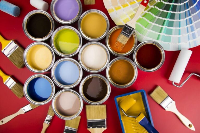
• High-Quality Paints for Long-Lasting Results
Achieving a fresh and bright look in small spaces involves investing in high-quality paints. Consider the following paint options for excellent coverage and durability:
- Water-based latex paints that offer easy application and cleanup as well as low odor.
- Acrylic paints, which have superior adhesion and water resistance.
- Semi-gloss or satin finish paint provides a subtle sheen, making the walls easier to clean and more light-reflective.
• Prepping Your Space for Painting
Before painting, it is essential to ensure that your small space is adequately prepared to achieve the best possible results.
- Clean the walls by wiping them down with a mild detergent and warm water to remove dirt and grease. Rinse thoroughly and let them dry completely.
- Use painter’s tape to protect the surfaces that you don’t want to paint, such as window frames, door jambs, and baseboards. Cover the floor and furniture with drop cloths to protect them from paint splatters.
• Essential Painting Tools and Accessories
To achieve a professional and long-lasting finish, use the following painting tools and accessories:
- High-quality brushes and rollers designed for interior paints.
- A paint tray or screen for efficient paint application.
- An extension pole for reaching high places.
- A step ladder to offer more stability while painting edges and corners.
- A putty knife and spackling paste to repair small holes, dents, or cracks in the walls.
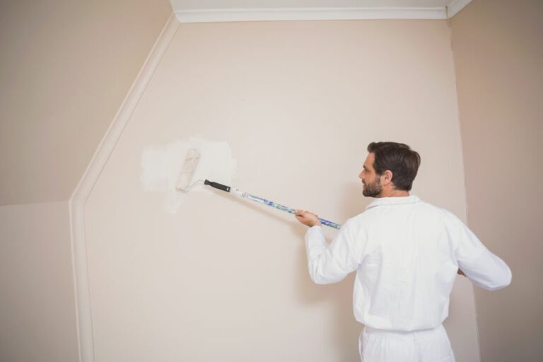
• Expert Painting Techniques for Small Spaces
Applying the right painting techniques can make your small space appear larger and brighter. Consider the following tips:
- Use a primer if you are changing from a dark to a light color, painting over a stained surface, or if the walls have never been painted before.
- Begin cutting in the edges with a brush to ensure clean lines where the walls meet the ceiling, floor, or adjacent walls.
- Apply the paint using a roller in a W pattern, overlapping each stroke for even and consistent coverage. Refrain from applying too much paint at once to avoid drips and streaks.
- Allow the first coat of paint to dry according to the manufacturer’s instructions before applying a second coat for a more opaque and professional look.
- After the final coat, carefully remove the painter’s tape to prevent peeling off the fresh paint.
• Maintaining Your Fresh and Bright Space
Take the following steps to maintain your newly painted small space:
- Keep your walls clean by dusting them regularly with a soft brush or vacuum cleaner attachment.
- Quickly clean any stains or marks with a damp cloth and mild detergent as soon as you notice them.
- Avoid excessive moisture buildup in bathrooms and kitchens by using exhaust fans or opening windows to reduce humidity.
- Touch up any scratches or chips with leftover paint to keep your walls looking fresh longer.
Following these tips will help you transform your small space with fresh, bright interior paint that not only enhances the beauty of your home but makes it feel larger and more inviting. Getting the job done right the first time will ensure longevity and satisfaction with your new space.
Top Color Choices to Enhance and Enlarge Small Rooms
A well-chosen color palette can make a world of difference in a cramped space. The right combination of colors can not only brighten up a small room but also create an inviting atmosphere. From soft pastels to rich hues, there are numerous options to choose from when it comes to transforming your living space.
• Soft Pastels: Subtle and Soothing
Pastel colors have a soothing quality that makes them an excellent choice for small spaces. Soft hues like mint green, baby blue, and blush pink create a serene environment and help promote a sense of calm. Additionally, their light-reflecting properties make the room feel more spacious as well.
– Recommendations:
- Mint green is an excellent option for those who prefer a touch of nature in their rooms. This fresh color can be paired with white or light grey furniture for a balanced appearance.
- Baby blue has a relaxing vibe that can create a perfect setting for bedrooms or living areas. Combine it with crisp white accents for a clean, coastal look.
- Blush pink can add a touch of femininity and warmth to your space. Pair it with gold or brass accents for a touch of elegance.
• Cool Neutrals: Calming and Spacious
Neutral colors like white, beige, and light grey are known for their ability to make a small space appear larger. These colors reflect natural light and create an airy, open atmosphere. They also serve as a blank canvas, allowing you to add pops of color through accessories and decor.
– Recommendations:
- White walls are a classic choice for making small spaces appear larger. However, be sure to add some warmth and texture to the room through textiles, plants, and wooden accents to avoid a sterile appearance.
- Beige is a versatile option that complements various styles and can be paired with both warm and cool tones. Consider adding colorful artwork or vibrant textiles to break the monotony.
- Light grey is a modern choice that can create a sophisticated backdrop for your space. Pair it with bold accent colors for an eye-catching contrast.
• Vibrant Hues: Lively and Energetic
Incorporating bold colors can make a small room feel lively and spirited. While it’s not advisable to use too many strong colors in a small space, using them strategically can create a visually interesting environment.
– Recommendations:
- Mustard yellow is an energizing color that can bring warmth and joy to your small room. Use it as an accent wall or pair it with neutral furniture and accessories for a more balanced look.
- Teal is a rich hue that adds depth while still maintaining a bright and inviting atmosphere. Pair it with light-colored furniture or textiles to prevent the room from feeling dark or heavy.
- Coral can be an excellent choice for those who want to infuse their space with a touch of playfulness. Pair this vibrant color with neutral tones or light greys for a contemporary look.
• Tips for Choosing the Right Color
- Assess the room’s natural light: The amount of natural light in your room significantly affects how colors appear. Rooms with ample sunlight can handle darker shades without feeling cramped, while those with limited light sources benefit from a lighter color palette.
- Consider the room’s purpose and mood: Different colors evoke different emotions; think about how you want to feel in the space and choose colors accordingly. For instance, blues and greens evoke tranquillity, whereas reds and oranges generate energy and excitement.
- Test your chosen colors: Before committing to a specific color, try painting a small area of the room or use color swatches to see how they interact with the room’s lighting and furniture.
In conclusion, selecting the right colors for your small room is critical in creating an illusion of a more extensive, brighter space. Keep in mind that overstated colors on all walls may reduce the rooms openness, so consider using a mix of pastels, neutrals, and vibrant hues to give your space character and depth.
Ultimately, the goal is to choose colors that resonate with your personal style while promoting an inviting and spacious atmosphere. For more interior design tips, visit the American Society of Interior Designers’ website.
Ideal Paint Colors to Enlarge and Brighten Small Rooms
A small room can feel constricting and unwelcoming, particularly when the wrong choice of paint color emphasizes its diminutive size. To enhance the visual perception of a small room, selecting a paint color that can create an illusion of space is crucial.
• Understanding the Role of Color Theory
Color theory plays a significant role in influencing how we perceive space. Light colors reflect more light, resulting in a brighter, more spacious appearance compared to darker shades that absorb light, making rooms feel smaller and cozier.
In addition to the lightness or darkness of a color, the choice of undertones and the finish used on the paint can impact the perceived size of a room.
– Cool and Neutral Colors
Cool colors, such as shades of blue, green, and violet, recede from the viewer’s eye, creating the illusion of more space. Furthermore, cool neutrals like gray or off-white tones can create a similar sense of expansion.
A personal recommendation is to select a pale blue or soft gray color for the walls, allowing for a calming atmosphere that seems more spacious.
• Maximizing Light Reflection with White
An all-white room is a classic choice for creating an illusion of spaciousness. The absence of color in a small room allows for light to bounce around freely, making it seem open and airy. However, it is important to choose the right shade of white, as some can feel cold and clinical.
Opting for a warm white with hints of yellow or beige is a great choice for softening a space without compromising the effect of an enlarged room.
A study from Delft University of Technology suggests that white neutrals can make a room look bigger compared to darker colors.
– Don’t Overlook Light Pastel Colors
While cool and neutral colors are widely recommended for creating a sense of space, light pastel colors can also achieve similar effects. Soft shades without strong undertones can bring a delicate sense of depth while adding warmth and character.
Popular pastel options include muted shades of pink, yellow, green, or lavender, designed to complement the overall design scheme and furniture choices.
• The Importance of Undertones
When selecting a paint color to enhance a small room’s perception of size, paying attention to the undertones within the chosen color can be vital. A warm undertone in a cool, neutral shade can disrupt the receding effect desired to make the room appear larger.
Always evaluate paint samples in varying lighting conditions to ensure that the undertones align with the intention of making a small room look bigger.
• The Role of Paint Finishes
The choice of paint finish can have a considerable impact on visual perception. A high-gloss or semi-gloss finish reflects more light, working to create the illusion of a larger space.
However, the reflection of light within the room also highlights imperfections on walls and surfaces, meaning a satin or eggshell finish may be preferable.
• Complementary Techniques to Enhance the Space
Aside from the paint color itself, several design choices can contribute to a small room looking bigger:
- Emphasize vertical lines to draw the eye upward and create the perception of height.
- Use large mirrors to reflect light and create the illusion of increased floor space.
- Select well-proportioned furniture, avoiding excess cluttering.
- Opt for minimal window treatments to maximize natural light levels.
• In Conclusion
The best color to paint a small room to make it look bigger is determined by a combination of factors, from the choice of light, cool, and neutral shades to careful consideration of undertones and finishes.
Pairing these decisions with complementary design elements will further enhance the perception of space, ensuring that even the smallest room can feel open and inviting.
Color | Effect in a Small Room |
|---|---|
Light Blue | Creates openness and a sense of space, making the room appear larger. |
Soft Gray | Provides a neutral background that makes a room feel larger and more spacious. |
Off-White | Reflects light, giving the illusion of a bigger and brighter space. |
Soft Green | Creates a soothing atmosphere and an impression of more space in a small room. |
Pale Yellow | Mimics sunlight, making the room feel bright, open, and spacious. |
Selecting Paint Colors for a Brighter, More Inviting Room
• Understanding Color Psychology
Colors can dramatically influence our emotions, thoughts, and overall well-being. Studies have shown that different colors have different effects on our moods and perceptions. Therefore, when trying to create a brighter atmosphere in a room, understanding the psychology of color is crucial.
A well-selected color can make a significant difference in the perceived brightness and spaciousness of a room. For more information on color psychology, visit the American Psychological Association’s website.
• Light Reflectance Value (LRV)
The Light Reflectance Value (LRV) of a color is the amount of visible light that a color reflects. It is measured on a scale of 0 to 100, where 0 absorbs all light, and 100 reflects all light. LRV is an essential factor when considering colors for making a room look brighter.
For instance, a paint color with an LRV of 60 reflects 60% of the light in the room, while a paint color with an LRV of 90 reflects 90% of the light. To create a brighter space, it is recommended to choose paint colors with higher LRVs.
• Colors That Make a Room Look Brighter
– White
White is the most reflective color, with an LRV value of 100. It gives a clean, fresh, and open feel to a room, making it an ideal choice for brightening dark spaces.
There are numerous shades of white, including cool-toned ones with a blue or green undertone and warm-toned ones with a yellow or red undertone. Customizing your choice of white paint to your room’s specific needs can enhance the brightness effect.
– Off-White and Light Neutrals
Off-white shades, such as cream, beige, and light gray, have a slightly lower LRV than pure white.
However, they still reflect a significant amount of light and can make a room look brighter. These colors are a good choice if you want to create a more inviting and cozy atmosphere while still making the room feel more spacious.
– Light and Soft Pastels
Pastel colors, such as pale blues, soft greens, and muted pinks, have an LRV between 60 and 80. These colors can make a room feel open and airy while adding a touch of color. Choose a pastel color for an elegant and relaxing atmosphere.
Light yellows with a soft undertone can also work well, as yellow is associated with happiness, optimism, and energy.
– Bright and Bold Colors
If you prefer a more vibrant look, consider brighter colors such as bold yellows, oranges, and greens. These colors have an LRV between 50 and 70 and can add a pop of energy to a room.
However, keep in mind that using too many bold colors in a small space may make the room feel smaller and more cramped. It is recommended to balance these bright colors with lighter shades or neutrals.
• Tips for Maximizing Brightness
– Use Glossy or Semi-Gloss Paint
The sheen of the paint also affects the amount of light a color can reflect. Glossy and semi-gloss paints reflect more light than matte or flat finishes, enhancing the brightness of a room. For a subtle sheen that still reflects light well, consider an eggshell or satin finish.
– Add Mirrors and Reflective Surfaces
Mirrors reflect light, making a room look brighter and more spacious, especially when placed opposite windows or light sources. Other reflective surfaces, such as glass or metallic accents, can also enhance the brightness and add visual interest to the room.
– Optimize Natural Light
Maximizing natural light can have a significant impact on a room’s brightness. Ensure windows are clean and unobstructed, use sheer curtains or blinds that allow light to pass through, and place furniture strategically to avoid blocking natural light sources.
Skylights and solar tubes are also great options for bringing in more natural light.
– Use Artificial Lighting
In spaces with limited natural light, artificial lighting becomes essential. A combination of ambient, task, and accent lighting can create a well-lit and inviting atmosphere. Consider using lightbulbs with a higher lumen output and a color temperature of around 3500K to 4000K (cool white) to mimic natural daylight.
By understanding the psychological effects of colors and their ability to reflect light, you can choose the right paint color and design elements to make any room look brighter and more inviting.
Experiment with different shades and finishes to find the perfect look for your space, and remember that maximizing natural and artificial light sources will have a significant impact on the overall brightness of a room.
Optimal Paint Selection for Dimly Lit or Windowless Rooms
A room with no or very little natural light can present a challenge when it comes to choosing the right paint color.
• Importance of Color Choice for Dark Rooms
Choosing the right paint color for dark rooms is crucial in creating an inviting atmosphere. Rooms with limited natural light can often feel small and claustrophobic. The right color and finish will help create an illusion of a larger and brighter space, improving the overall ambiance of the room.
– Light Reflectance Value (LRV)
One important aspect to consider when choosing paint for darker rooms is the Light Reflectance Value (LRV) of the color. LRV is a measure of how much light a paint color reflects. A higher LRV indicates more reflected light, which can make the room appear brighter.
You can often find the LRV of the paint color on the paint’s swatch, label, or in the paint company’s database. Choosing a color with a higher LRV will help create a brighter and more welcoming space. Sherwin Williams LRV Database is an excellent resource for looking up LRV values for specific colors.
• Top Paint Color Recommendations for Dark Rooms
Here are some paint color recommendations to consider for rooms with no light based on their light-reflecting qualities and the desired mood or atmosphere.
– Off-White and Light Neutrals
Light neutral shades are an excellent choice for dark rooms. Off-whites, beiges, and light grays provide a clean and modern look while reflecting light effectively. These colors can also serve as a blank canvas, allowing you to add pops of color to furnishings, fabrics, and accessories.
I recommend:
- Sherwin Williams “Alabaster” (LRV 82)
- Benjamin Moore “White Dove” (LRV 85)
- Farrow & Ball “Slipper Satin” (LRV 67)
– Soft Pastels
Soft pastel shades can be both soothing and visually uplifting. These colors provide a feeling of warmth and comfort in rooms with limited natural light. Colors such as soft pinks, muted blues, and pale greens make a space feel more inviting.
I recommend:
- Sherwin Williams “Sea Salt” (LRV 63)
- Benjamin Moore “Wind’s Breath” (LRV 71)
- Farrow & Ball “Pink Ground” (LRV 66)
– Light-Saturated Colors
Bright, saturated colors can add energy and visual interest to a room without overwhelming it. Look for colors with a soft hue, like a vibrant yellow or a deep but light blue. These colors can add a cheerful touch and help counteract the lack of natural light.
I recommend:
- Benjamin Moore “Sunlight” (LRV 77)
- Sherwin Williams “On the Rocks” (LRV 62)
- Farrow & Ball “Cook’s Blue” (LRV 50)
• Paint Finish for Dark Rooms
In addition to the color, the paint finish can have a significant impact on the room’s brightness. Matte finishes tend to absorb more light, while glossy finishes reflect light and can make a room appear brighter.
Generally, it’s best to use a satin or eggshell finish in rooms with no light, as these finishes provide a subtle sheen without being overly shiny.
• Additional Tips for Brightening Dark Rooms
Aside from choosing the right paint color and finish, there are several other ways to improve rooms with no light:
- Add mirrors to reflect light and make the room appear larger.
- Choose lightweight window treatments that allow for maximum light penetration.
- Incorporate lamps and other light sources to add brightness to your space.
- Use light-colored furniture, accessories, and wall dcor to maintain a cohesive look.
In conclusion, when selecting paint for rooms with no light or limited light sources, consider factors such as LRV, color, and paint finish. By paying attention to these details, you can make your dark room more welcoming and enjoyable.
Paint Type | Colors | Reason |
|---|---|---|
Light Reflecting Paint | White, Off-white, Light grey | Maximizes the light in the room, making it appear brighter and more spacious |
Semi-Gloss Paint | Light colors: Pastel blue, pale yellow, soft pink, etc. | Higher sheen reflects light better, making the room appear brighter |
Satin Finish Paint | Light neutrals: Beige, Cream, Light brown, etc. | Provides a slightly glossy finish, reflects light and adds warmth to the room |