Best Paint Colors For Interiors
Choosing the perfect paint color for your home can be overwhelming, but you’ve come to the right place. With years of experience in interior design, I’ve got the inside scoop on the best paint colors that will transform your space while reflecting your style.
Best paint colors for interiors:
The best interior paint colors for home interiors include neutral shades like gray, beige, and greige; tranquil blues for a calm and serene feel; earthy greens such as sage and olive for a natural and soothing vibe; and energizing yellows for a bright and cheery atmosphere. These colors can help create a cohesive and appealing space, enhancing a room’s look and feel.

Unsure about which paint colors to choose for your home’s interior? Fear not! This comprehensive guide on the best interior paint colors will help you create spacious, warm, and inviting spaces. Read on as I reveal top color trends, expert tips, and ideal pairings for every room.
Contents
- 1 Top Interior Paint Colors: A Guide for Every Space
- 2 Trending Interior Wall Colors: Find the Perfect Hue
- 3 2023’s Best Interior Color Fashions: A Comprehensive Outlook
- 4 Soothing Interior Design Colors: Serenity Transformed
- 5 Uniformity Vs. Variety: Is a One-Color Home Right for You?
Top Interior Paint Colors: A Guide for Every Space
Choosing the perfect paint color for your home can be overwhelming, especially considering that the color you choose will significantly affect the overall look and feel of your space.
• The Power of Neutrals: A Timeless Option
Neutral paint colors are popular for home interiors as they create a clean, fresh, and elegant look. Also, they provide a canvas for a wide variety of decor styles and color accents.
– Gray: The Ultimate Neutral
A popular choice for many homeowners, gray offers a modern and sophisticated look. Whether you opt for a soft, more subtle shade like Benjamin Moore’s Edgecomb Gray or a bolder option such as Sherwin-Williams’ Agreeable Gray, this versatile hue offers endless possibilities for your space.
– Beige and Greige: Warm and Inviting
If you prefer a warmer neutral, beige and greige (a blend of gray and beige) are excellent options. Beige colors like Benjamin Moore’s Shaker Beige provide a cozy, inviting look, while greige paint colors like Sherwin-Williams’ Anew Gray perfectly balance warm and cool undertones.
• Tranquil Blues: Calm and Serene
Blue is a classic interior color that exudes a sense of serenity and calm, making it ideal for bedrooms and bathrooms.
– Soft, Light Blues
For a serene, relaxing atmosphere, try soft, light blues like Farrow & Ball’s Parma Gray or Benjamin Moore’s Mount Saint Anne. These colors evoke a sense of peace and tranquility, promoting relaxation and creating the perfect sanctuary.
If you’re looking for a way to make a statement with blue, navy is a bold and sophisticated option. Try Sherwin-Williams’ Naval or Benjamin Moore’s Hale Navy for a dramatic look in spaces such as dining rooms or living rooms.
• Earthy Greens: Natural and Soothing
Green is a versatile paint color connecting us to nature, promoting tranquility and harmony.
– Sage: Elegant and Versatile
Sage green is a timeless and elegant color that works well in both traditional and modern spaces. For a beautiful sage option, try Farrow & Ball’s French Gray. This hue brings the outdoors in and works wonderfully in bedrooms, bathrooms, and living areas.
– Olive: Rich and Relaxing
Consider an olive-tone like Benjamin Moore’s Greenbrier Beige for a deeper, moodier green. This rich, earthy color creates a warm and inviting atmosphere, making it ideal for all living areas, including family rooms and dining rooms.
• Energizing Yellows: Bright and Cheery
Yellow is a color known for its uplifting and energizing properties, making it an excellent choice for kitchens, dining areas, and sunrooms.
– Soft Yellow: Subtle and Refreshing
A soft, muted yellow like Farrow & Ball’s Babouche is warm and welcoming, creating a bright, relaxed atmosphere perfect for everyday spaces.
– Bold Mustard Yellow: Vibrant and Invigorating
If you’re looking to make a statement, vibrant mustard yellow like Benjamin Moore’s Golden Retriever will infuse your space with energy and excitement. Pair it with neutral accents for a well-balanced look.
In conclusion, there are countless paint color options for your home interiors, but by considering the mood and atmosphere you wish to create and the room’s purpose, you can create a beautiful, cohesive space.
And when in doubt, consult a professional – many interior designers offer color consultations to help guide you through the selection process. Happy painting!
Color name | Color Description | Best for |
|---|---|---|
Classic Blue | A timeless and elegant shade of blue | Bedrooms, living rooms |
Soft Gray | A neutral and inviting shade of gray | Living rooms, kitchens |
Blush Pink | A pale and sophisticated shade of pink | Bedrooms, bathrooms |
Rich Green | A bold and vibrant shade of green | Dining rooms, home offices |
Taupe | A warm and earthy shade of beige | Living rooms, hallways |
Off White | A versatile and timeless shade of white | Bedrooms, living rooms |
Trending Interior Wall Colors: Find the Perfect Hue
When it comes to selecting the perfect color for your interior walls, you may find yourself overwhelmed by the vast array of options available in the market. There is no absolute answer to the question of which color is the most popular, as personal preferences and current trends constantly evolve.
• Neutral Wall Colors: A Timeless Choice
Neutrals are among the most common and well-loved choices for interior wall colors. These colors have a timeless quality and include shades like white, beige, gray, and greige (a blend of gray and beige).
– White: A Classic Choice
White is a classic color that is often used in interior design due to its versatility and ability to make a space feel larger and more open. There are many shades of white to choose from, each offering a unique mood to your interiors.
You can find whites with cool or warm undertones, allowing them to blend seamlessly with various furniture and accessory colors. The Benjamin Moore Paint Company offers a vast range of white shades that cater to different preferences.
– Beige and Greige: The Perfect Balance
If you’re looking for a color that’s a bit warmer and cozier than white, beige and greige may be perfect for your interior walls. These colors can make your home feel inviting and comfortable while still keeping things looking bright and clean.
They are versatile and can work in a variety of home styles, from modern to rustic. A popular choice among beige shades is Benjamin Moore’s Revere Pewter, a greige color praised for its adaptability to diverse design schemes.
– Gray: A Sophisticated Choice
For those who prefer a more modern aesthetic, gray is an increasingly popular color for interior walls. Gray offers a sense of sleek sophistication and can be adjusted with different undertones to match your personal style.
Light gray shades create a calm, serene atmosphere, while darker grays make a bold statement.
• Bold Accent Colors: Making a Statement
While neutral colors are popular choices for interior walls, many homeowners are now opting to incorporate bold accent colors to create a striking focal point. These colors can be used on one wall, in a small nook, or even on the ceiling to bring some excitement and style to your living spaces.
– Blues: Calming and Inviting
Blue is an all-time favorite for many when it comes to accent colors. From bold navy blues to soft, soothing sky blues, this color can instantly elevate your home’s appearance.
According to a University of Kentucky study, blue is often associated with feelings of calmness and relaxation, making it a perfect choice for bedrooms and living spaces.
– Greens: Natural and Fresh
Green is another popular choice for accent walls, as it can evoke a feeling of nature and freshness. Dark, moody greens make a bold statement, while lighter shades like sage green create a soothing atmosphere.
Adding green to your decor can help you feel more connected to the natural world and promote a sense of balance and harmony.
– Earthy Tones: Warm and Cozy
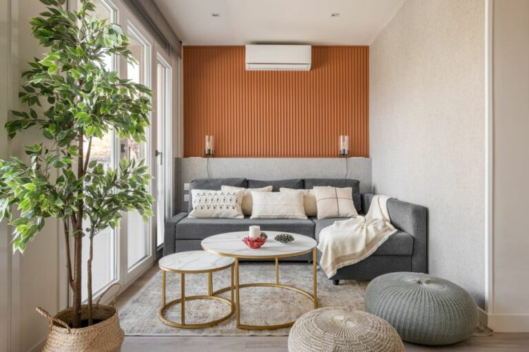
If you want to add warmth and sophistication to your home, earthy tones like terracotta and burnt orange are excellent choices.
These colors can create a cozy, inviting atmosphere, perfect for social spaces like dining rooms and living rooms; pair well with neutral shades or natural materials like wood and stone for a refined, elegant look.
• Tips for Choosing the Right Color
Finding the ideal wall color for your home can be tricky, so here are some expert tips to help you make the right decision:
- Consider the lighting. Keep in mind that colors can appear differently in natural light versus artificial light, so it’s essential to test out paint samples in various lighting situations.
- Take your furniture and accessories into account. Your wall color should complement the existing design elements in your space (such as rugs, curtains, and artwork) rather than clash with them.
- Start small. If you’re unsure about how a particular color might work in your home, consider painting a smaller area first, such as an accent wall or a piece of furniture, to see if you like it.
In conclusion, while there is no definitive answer to the most popular color for interior walls, neutral shades like white, gray, and beige remain popular choices, with many homeowners also incorporating bold accent colors like blue or green.
Ultimately, the best color for your space will depend on your personal preferences and your home’s existing design elements. So don’t be afraid to experiment with different shades and combinations until you find the perfect match for your interiors.
2023’s Best Interior Color Fashions: A Comprehensive Outlook
• Captivating Color Trends to Watch
As 2023 approaches, new and exciting interior color trends are emerging, offering fresh and innovative ways to transform our living spaces.
– Earth Tones: Embrace Nature’s Warmth
Earth tones are predicted to make a strong comeback in 2023. This color palette includes warm and cozy hues such as deep browns, tans, terracotta, muted greens, and blues.
Earthy colors bring a sense of serenity and grounding to any space, making them an excellent choice for living rooms, bedrooms, and even kitchens. I recommend incorporating earth tones through paint, textiles, and accessories to create an inviting and harmonious atmosphere.
More information on earth tones and their benefits can be found at the Smithsonian Environmental Research Center website.
– Jewel Tones: Add Depth and Luxury
Jewel tones, including rich emerald green, sapphire blue, and deep amethyst purple, are another popular choice for 2023. These vibrant and luxurious hues can create a sense of sophistication and drama in any room.
For those looking to make a bold statement, consider using a jewel-toned paint color on an accent wall or as the primary color in a smaller space like a powder room. Alternatively, introduce jewel-toned furniture or accessories for a more subtle touch.
– Soft Pastels: A Touch of Whimsy
Soft pastels, such as blush pink, light lavender, and dusty blue, will continue to be popular choices in 2023. These delicate hues evoke calmness and serenity, providing the perfect backdrop for relaxed living spaces.
I recommend using soft pastels on walls and large furniture pieces, then balancing them with neutral accents and textures. This approach will ensure a cohesive and well-rounded design.
– Monochromatic Palettes: Elegance and Simplicity
For a timeless and elegant look, consider a monochromatic color scheme. This can include varying shades of the same color, such as different grays, blues, or greens. Monochromatic palettes are particularly suited for modern and minimalist interiors.
When working with a monochromatic palette, I recommend using a mixture of light and dark shades to create depth and visual interest. Additionally, incorporate textural elements, such as wood, metal, and fabric, to prevent the space from feeling too one-dimensional.
– Bold Accent Colors: Make a Statement
In 2023, we will continue to see bold accent colors used to create visual interest and focal points within a room. These vibrant hues, such as bright yellows, fuchsia, and electric blue, can be incorporated through artwork, furniture, or small accessories.
However, it’s crucial to maintain balance within the space when working with bold colors. Ensure that the more vivid hues are tempered with neutral elements so the overall design remains cohesive and inviting.
The Color Marketing Group offers valuable insights into current color trends and how to use them in your interior design projects effectively.
• Expert Tips for Choosing and Implementing the Right Colors
Now that you’re familiar with the top interior color trends for 2023, here are a few expert tips to help you choose and implement the perfect hues in your home:
- Consider the room’s function and mood: Before selecting a color palette, think about the room’s purpose and the atmosphere you want to create. For example, a restful bedroom might benefit from soft pastels, while a bold accent color could bring energy to a home office.
- Test colors before committing: Paint a small swatch on your wall or use peel-and-stick samples to test colors in your space. This will help you determine how a color looks in different lighting conditions and within the context of your home.
- Start with a neutral base: When introducing new colors, it’s often helpful to begin with a neutral base. This approach provides a foundation for more vibrant hues without overwhelming the space.
- Use the 60-30-10 rule: This design principle suggests using 60% of a dominant color, 30% of a secondary color, and 10% of an accent color. This will help create a balanced and visually appealing design.
- Incorporate different textures: Combining various textures, such as wood, fabric, and metal, can add depth and visual interest to your space, especially when working with a monochromatic or muted color palette.
In conclusion, being aware of the latest interior color trends and expert recommendations will help you make informed decisions when updating your home’s design.
By embracing these popular hues and following design best practices, you can create a stylish and inviting space you’ll love for years.
Color | Description |
|---|---|
Soft Pastels | Light and soothing colors like mint green, pale pink, and sky blue. |
Earthy Neutrals | Warm and natural colors like beige, sand, and taupe. |
Deep Blues | Rich and calming shades like navy blue and royal blue. |
Muted Greens | Soft and earthy tones like sage green and olive green. |
Warm Grays | Cozy and versatile shades like dove gray and light charcoal. |
Soft Whites | Clean and minimalist shades like ivory, cream, and off-white. |
Moody Darks | Bold and dramatic shades like black, eggplant, and deep emerald. |
Soothing Interior Design Colors: Serenity Transformed
When it comes to creating a peaceful and serene environment within the home, selecting calming colors for interior design plays a crucial role. In essence, colors have a profound psychological effect on our emotions and can significantly impact feelings of calm and relaxation.
• Cool and Neutral Tones
Generally, cool and neutral shades are considered the most calming colors for an interior. They create a soothing atmosphere promoting relaxation, tranquility, and a sense of balance.
– Blue
Blue is a strong contender for the most calming color in interior design. It promotes relaxation and serenity, making it perfect for bedrooms, bathrooms, and other spaces intended for unwinding. Light shades of blue, such as sky and powder blue, are particularly known for their stress-reducing effects.
According to Psychology Today, exposure to the color blue may help to lower blood pressure, reduce anxiety, and slow heart rates.
– Green
Another calming color is green, which represents nature and promotes a sense of balance and renewal. It provides a restorative and soothing effect, making it perfect for living rooms, bedrooms, and even home offices.
Various shades, such as sage and mint green, are recommended for their calming properties.
– Gray
Gray, a neutral color, often projects both calm and sophistication in interior design. Working well in contemporary and minimalist spaces, light shades of gray can create a serene and tranquil atmosphere.
However, adding warmth and personality through accent colors, textures, and patterns is essential to prevent the room from looking dull and lifeless.
• Warm and Analogous Hues
While cool and neutral tones dominate the discussion of calming colors in interior design, warm and analogous hues can also create a comfortable and inviting environment.
– Soft Pink
Soft shades of pink, such as blush or dusty rose, can invoke feelings of calm and warmth. These hues are particularly popular for nurseries and children’s rooms, as they promote a comfortable and inviting atmosphere.
In addition, soft pink can be used in other spaces, such as living rooms and bedrooms, to create a cozy and nurturing environment.
– Lavender
Lavender is another warm and calming color that combines blue’s relaxation properties and pink’s warmth. This shade is particularly suitable for bedrooms, as it promotes restful sleep and tranquility.
Additionally, lavender works well with other calming colors, such as light gray and soft pink, to create a harmonious color scheme.
– Earthy Browns
Earthy browns like beige and taupe can create a comforting and grounding atmosphere. These colors work particularly well in living rooms and other communal spaces, where a sense of cohesion and relaxation is desired.
Pairing earthy browns with other calming shades, such as soft greens and blues, can enrich the overall color scheme and add visual interest to the space.
• Tips for Using Calming Colors in Interior Design
When incorporating calming colors in your space, consider the following expert tips:
- Balance: Ensure your color scheme achieves a balance by using both warm and cool shades in conjunction with neutral tones. This approach creates visual interest and prevents the space from feeling monotone.
- Texture: To increase the soothing effects of your calming colors, incorporate textured elements such as throws, rugs, and pillows. This addition adds warmth and depth to the space.
- Accent Colors: Introduce splashes of accent colors via accessories and artwork to add depth and interest to your calming color scheme without overwhelming the space.
- Lighting: Choose the appropriate lighting for your space, as it significantly highlights your calming color scheme. Soft and warm lighting tends to enhance relaxation and complement your chosen shades.
- Room Function: Select your calming colors based on the function of the room. For example, bedrooms and bathrooms may benefit more from cool and soothing blues, whereas living rooms and communal spaces may require a combination of warm and cool shades.
In conclusion, selecting calming colors for interior design is an effective way to create a tranquil and harmonious environment within the home. Consider incorporating cool and neutral shades such as blue, green, and gray alongside warm and analogous hues like soft pink, lavender, and earthy browns.
When combined with thoughtful lighting, texture, and balance, these colors can help to create a peaceful haven perfect for relaxation and rejuvenation.
Color | Description |
|---|---|
Soft blue | It represents tranquility and calmness, often associated with the sky and water. |
Lavender | A soft purple color that creates a soothing and peaceful atmosphere. |
Green | Represents nature, growth, and harmony, creating a feeling of balance and relaxation. |
Gray | A neutral color that can create a feeling of warmth and coziness when used in the right shades. |
Blush pink | A soft shade of pink that promotes feelings of warmth, comfort, and relaxation. |
Soft white | A gentle and soothing color that can create a sense of spaciousness and tranquility. |
Uniformity Vs. Variety: Is a One-Color Home Right for You?
There is no one-size-fits-all answer to whether your whole house should be painted the same color, as it is a matter of personal preference and style.
I will discuss the pros and cons of painting your entire home with a single color, offer tips on choosing the right color for your house, and provide alternative solutions to create a cohesive color scheme throughout your space.
• Pros of Painting Your House the Same Color
– Consistency and Flow
One of the main benefits of using a single color throughout your house is the consistency and flow this technique creates.
When connected spaces share the same color, they appear more cohesive and harmonious. This can make your home feel calm and inviting, especially if you choose a neutral or muted color with a soothing effect.
– Ease of Decorating
When you don’t have to worry about coordinating multiple paint colors, it becomes easier to make decorating decisions.
You can focus on finding furniture, artwork, and accessories that complement your chosen paint color without needing to consider how these elements will interact with different hues in other rooms.
– Simplified Paint Decision
Sticking to a single color can simplify the decision-making process for those who feel overwhelmed by the endless array of paint colors and finishes available. Once you’ve chosen a hue you love, you can move forward with confidence, knowing that it will work well throughout your home.
• Cons of Painting Your House the Same Color
– Lack of Visual Interest
Using a single color throughout your entire house can result in a lack of visual interest or personality in individual rooms. Different colors can evoke different moods and emotions, so if you’re aiming to create a unique atmosphere or experience in each space, using a single color may not be the best approach.
– Inability to Highlight Architectural Features
If your home has notable architectural features or elements that you’d like to emphasize, using a single, uniform paint color can make them blend in rather than stand out. You can highlight these special touches by introducing different colors and add character to your space.
– Difficulty in Differentiating Function
Different paint colors can help to differentiate the purpose or function of various rooms in your home. For example, a calming blue hue might be ideal for a bedroom, while a bold red creates an energizing atmosphere in a dining area.
In a single-color home, this functional distinction may be less apparent, which can impact the atmosphere and usability of your space.
• Tips for Choosing the Right Color for Your House
If you’re leaning toward painting your whole house the same color, here are some tips to help you select your ideal hue:
– Consider Your Home’s Natural Light
Assess the natural light in each room of your home, as this plays a significant role in how a paint color will appear. Lighter colors can help smaller, darker rooms feel airier, while darker colors can create a cozy ambiance in a well-lit space.
– Test Color Swatches
Paint swatches on your walls and observes them at different times of day to make sure you’re happy with how the color looks in various lighting situations. Make sure to test the color in different rooms, as it may appear differently from one space to the next.
– Opt for Timeless Neutrals
Neutral colors are typically the safest choice when painting an entire home with a single color. Grey, taupe, and white hues are versatile and timeless and can create the perfect backdrop for any decorating style.
• Alternative Solutions: Cohesive Color Schemes
If you’re unsure about committing to one color for your entire home, consider creating a cohesive color scheme using complementary or analogous colors. This approach lets you introduce some variety into your space and can lead to a more visually interesting and personalized design.
In fact, many interior designers recommend using color palettes rather than a single color for a truly harmonious and well-thought-out home design.
In conclusion, deciding to paint your entire house the same color comes down to your preferences, the atmosphere you want to create, and your home’s architecture and lighting. Choosing a single color has benefits, such as consistency and easier decorating decisions.
On the other hand, multiple colors can add interest and character to your space. Regardless of your choice, it’s essential to select a color or color scheme that resonates with you, reflects your personal style, and enhances the overall appeal of your home.

