Color Schemes For Confined Interiors. What Pros Say
Are you overwhelmed with choosing the perfect color scheme for your confined interior space? We’ve got you covered! With our expertise in interior design, we’ll help you turn your constricted rooms into cozy and visually appealing retreats. We will introduce you to various color combinations that enhance the aesthetic value and create an illusion of more space, giving you the comfortable and stylish living area you deserve.
Color schemes for confined interiors:
Color schemes for confined interiors can effectively enhance the perception of space and overall ambiance. Options include monochromatic, analogous, and neutral palettes with pops of color. Additionally, incorporating patterns or textures can create visual interest. Consider the desired mood, function, and personal taste when selecting a palette.

Dive deeper into the world of color schemes as we explore how to make confined interiors more inviting, appealing, and spacious. Let us be your guide to transforming your compact space into a vibrant haven. Read on to uncover our palette of secrets!
Contents
- 1 Space-Saving Color Palettes for Small Interiors
- 2 Exploring the Triadic Color Principle in Interior Design
- 3 7 Essential Interior Design Color Schemes
- 4 Top Color Choices for Healthcare Facility Interiors
- 5 Steps to Selecting the Perfect Interior Color Palette
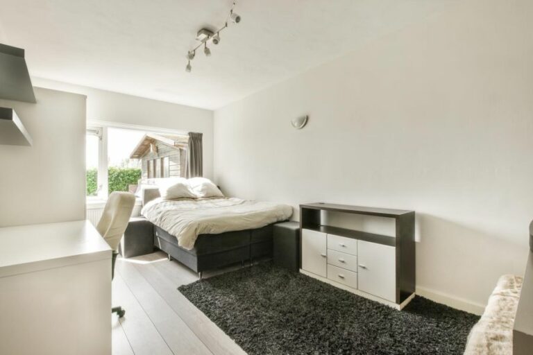
Space-Saving Color Palettes for Small Interiors
Creating a visually appealing and comfortable environment in confined interiors is a challenge that many people face when trying to design their living or working spaces.
One of the most impactful ways to transform a small room into an inviting, spacious, and stylish space is with the use of color schemes. Selecting an appropriate color palette can significantly impact the overall ambiance and even the perceived size of a confined area.
• Understanding Color Psychology in Interior Design
The effect that colors have on our emotions and well-being cannot be underestimated. Various studies confirm the connection between colors and our psychological state. When choosing colors for small spaces, consider the purpose of the room and the emotions you want to evoke.
– Warm and Cool Color Tones
Generally, colors are divided into warm and cool tones. Warm colors, like red, orange, and yellow, tend to create an energizing and comfort-inducing mood, making them suitable for vintage and eclectic-styled spaces.
Cool colors, like blue, green, and violet, evoke a sense of calm, serenity, and openness, making them apt choices for modern, minimalist, and tranquil interiors.
• Monochromatic Color Scheme: Effortless Sophistication
A monochromatic color scheme employs different shades, tones, and tints of a single hue. This scheme allows you to play with color more controlled and cohesively while creating a seamless, harmonious, and sophisticated space.
Various textures and patterns are recommended when working with a monochromatic palette to maintain interest and prevent the room from becoming too monotonous.
When implementing this color scheme in a confined space, I recommend choosing a lighter base color for your walls and flooring, as it gives the illusion of spaciousness. Incorporate darker shades of the chosen hue through furniture, cushions, and rugs to add depth and visual interest.
• Analogous Color Scheme: Balanced Harmony
An analogous color scheme utilizes colors that are adjacent to each other on the color wheel, resulting in a harmonious and cohesive color palette. This scheme can be a great option for small spaces since it allows for the introduction of additional hues in a balanced manner without overwhelming the interior.
To implement an analogous color scheme for confined interiors, pick a primary color as your base and incorporate the neighboring colors in accents and decor. For instance, a primarily blue room can benefit from accents of aqua and periwinkle, creating a sense of calm and tranquility that is not overpowering.
• Neutrals with Pops of Color: Subtle Statements
Neutral palettes are a timeless and practical choice for small spaces; however, they can sometimes feel bland and lack personality. One way to create visual impact without clashing with the space’s size is by adding pops of bright, bold, or contrasting colors through accents, artwork, or textiles.
This technique allows for greater flexibility in your design since it’s easy to swap out or update the accent pieces without compromising the overall aesthetic. When using pops of color, remember to maintain balance and proportion, as too much color can cause the room to feel chaotic and cluttered.
• Experimenting with Patterns and Textures
When dealing with confined interiors, visual diversity, and interest can also be achieved through the thoughtful use of patterns and textures in conjunction with curated color schemes. These elements can create dimension, emphasize focal points, and add a touch of personal style to the room.
Geometric or striped patterns are particularly effective in enhancing the perception of space, making the room appear elongated or broader than it is. On the other hand, utilizing varied textures like smooth, rough, shiny, or matte finishes will create depth and contribute to the overall visual appeal of the interior.
• Final Thoughts
Ultimately, the best color scheme for confined interiors is subjective and depends on the desired mood, function of the room, and personal taste.
It may require some experimentation and iteration, but by keeping the principles discussed in this article in mind, you’ll be well-equipped to create the illusion of spaciousness and design a visually appealing and comfortable environment in your small space.
Exploring the Triadic Color Principle in Interior Design
Understanding colors and their interactions is a basic yet powerful concept in interior design. When decorating a space, the three-color rule can help create a visually stunning and harmonious atmosphere.
As an experienced designer, I’ve seen this rule work wonders, and I highly recommend leveraging it to elevate any living or working space.
• The Essence of the 3-Color Rule
The three-color rule is a design principle that involves balancing three primary colors in a room for an aesthetically pleasing result. By implementing the three-color rule, you ensure a cohesive and balanced look throughout your space. The three colors in question consist of the following:
- A dominant color
- A secondary color
- An accent color
Each of these colors performs a specific function and contributes to the overall visual appeal and balance of the space.
– Dominant Color: The Backbone of Your Design
The dominant color acts as the base and is the most prevalent color in the room. This color often sets the overall mood and ambiance. Walls, large furniture pieces, and flooring typically exhibit the dominant color since they must establish a strong visual presence.
Neutral colors, such as white, gray, or beige, are popular choices for dominant colors due to their versatility and ability to create a calm atmosphere.
– Secondary Color: The Supporting Act
The secondary color is vital in complementing and enhancing the dominant color. It creates balance and prevents the dominant color from becoming overwhelming. Often, the secondary color appears in mid-sized furniture pieces, curtains, rugs, and decorative elements.
Ensure that your secondary color works well with the dominant color but does not take the spotlight.
– Accent Color: The Pop of Personality
The accent color serves as a contrast, bringing that much-needed pop to make the room come alive. As the name suggests, it should be used sparingly and thoughtfully to accentuate specific details and focal points.
The accent color is where you can showcase your personality and creativity by using bold, vibrant hues. Accessories, artwork, throw pillows, and small decorative items are great ways to introduce the accent color.
• Tips for Applying the 3-Color Rule
– Understand Color Theory
Learning about color theory can improve your ability to choose the best color palette. Familiarize yourself with the color wheel, and understand how colors work together.
For example, you can use complementary colors (those opposite each other on the color wheel) or analogous colors (those adjacent to the color wheel) as a basis for your palette.
– Pay Attention to Proportions
Keeping proportions in mind when implementing the three-color rule is essential. A commonly recommended proportion is the 60-30-10 rule, where 60% of the room features the dominant color, 30% showcases the secondary color, and 10% highlights the accent color.
However, you can adjust these percentages based on your personal preferences and the uniqueness of each space.
– Consider the Room’s Function and Purpose
Remember to consider the purpose of the room and the mood you aim to create. Bedrooms generally benefit from calming and soothing color palettes, while living rooms or offices might benefit from more vibrant or energetic colors.
Ultimately, you should select colors reflecting the room’s purpose and contribute to the atmosphere.
– Don’t Be Afraid to Experiment
Finally, do not be afraid to break the rules and experiment. Although the three-color rule is an excellent guideline, it shouldn’t limit your creativity. If you feel that adding another color or modifying the proportions improves your space, try it. After all, interior design is a creative process.
• Trusted Resources for Further Reading
I recommend visiting the Color Matters website for a deeper understanding of the three-color rule, color psychology, and interior design. This educational resource delves into the science and psychology of color, offering insights into color usage across various fields, including interior design.
In conclusion, the three-color rule is a valuable design principle that ensures harmonious, visually appealing, and balanced color palettes in interior spaces.
Understanding the roles of dominant, secondary, and accent colors and maintaining proper proportions can transform any space into a beautiful and functional area. Embark upon your interior design journey with confidence and creativity, and let the three-color rule guide your success.
7 Essential Interior Design Color Schemes
• 1. Monochromatic Color Scheme
A monochromatic color scheme revolves around a single hue but involves various shades, tints, and tones of that specific color. This scheme can create a cohesive, sophisticated, and harmonious look appealing to many.
One of the primary advantages of this scheme is its simplicity, making it an excellent choice for beginners or those looking to create a minimalist space. Additionally, incorporating different textures and materials can add depth and interest to the monochromatic design.
It is worth mentioning that the Color Theory can provide valuable insights into how monochromatic schemes work and how to create them properly.
• 2. Analogous Color Scheme
An analogous color scheme involves colors that are adjacent to one another on the color wheel. This scheme is often found in nature and can create a sense of harmony and balance in a space.
When utilizing an analogous color scheme, choosing one dominant color, a secondary color, and accent color is essential to maintain balance and prevent the colors from overwhelming the space.
• 3. Complementary Color Scheme
A complementary color scheme features colors that sit opposite each other on the color wheel. This scheme provides a high level of contrast and can create a vibrant, energetic space. However, it is crucial to use complementary colors judiciously to avoid a chaotic appearance.
A common approach is to use one color for dominant elements and the complementary color as an accent.
For those interested in learning more about complementary color schemes, Adobe Color offers a fantastic tool that allows users to experiment with different complementary color combinations.
• 4. Split-Complementary Color Scheme
The split-complementary color scheme is a variation of the complementary scheme. Instead of using the exact opposite color on the color wheel, this scheme employs the two colors adjacent to the complementary hue.
This approach offers the same level of contrast without the risk of clashing colors. It is an excellent option for those looking for a more sophisticated and less intense design.
• 5. Triadic Color Scheme
A triadic color scheme consists of three colors that are equidistant from each other on the color wheel. It is a more vibrant and dynamic choice than other color schemes, as it offers contrast and harmony simultaneously.
To effectively use a triadic color scheme, it is necessary to choose one dominant color and use the other two colors sparingly as accents.
• 6. Tetradic Color Scheme
Also known as the double-complementary color scheme, the tetradic scheme includes four colors consisting of two pairs of complementary hues. When using a tetradic color scheme, it is crucial to balance the distribution of colors to establish harmony within the space.
Additionally, this scheme requires careful attention to the proportion of dominant and accent colors.
• 7. Neutral Color Scheme
A neutral color scheme involves a combination of black, white, and gray or various shades of beige, tan, or brown. This scheme creates a calm, understated, and sophisticated appearance in a space.
Neutral color schemes can also act as a backdrop for accent colors or pieces, allowing them to become the focal point within the room.
For guidance on using neutral colors in interior design, Benjamin Moore’s trend forecast discusses the various ways to incorporate these hues into any space.
In conclusion, the choice of color scheme can significantly impact a space’s overall atmosphere and aesthetic. Understanding these seven basic color schemes and how to use them effectively will help create a cohesive and harmonious interior design that perfectly suits your needs and preferences.
Top Color Choices for Healthcare Facility Interiors
A hospital’s interior can have a significant impact on the well-being and recovery of patients. In fact, research has shown that the choice of colors, particularly wall colors, can even influence patients’ and staff’s moods and behavior.
Therefore, it is crucial to carefully choose the colors for a hospital interior to create a welcoming and calming environment while also considering hygiene and functionality.
• Soothing and Calming Colors
In a hospital setting, it is important to select colors that will help patients feel calm and relaxed. These soothing colors can have a calming effect on patients, particularly those who are anxious, stressed, or in pain.
– Soft Blues and Greens
Light shades of blue and green are known to evoke feelings of tranquillity and relaxation, making them an ideal choice for areas where patients will spend a considerable amount of time.
– Pastel Tones
Pastel shades like light pink, lavender, and soft yellow can also create a gentle and comforting atmosphere for patients. These colors can be used in patient rooms, waiting areas, and even corridors to maintain a peaceful and calming environment throughout the hospital.
• Energizing Colors for Rehabilitation Areas
In contrast to the soothing colors mentioned earlier, certain areas of the hospital may benefit from the use of more energizing colors. These are particularly useful in spaces where patients need motivation and alertness, such as rehabilitation, physiotherapy, or activity rooms.
– Vibrant Oranges, Reds, and Yellows
Bright and warm colors like orange, red, and yellow are known to be stimulating and invigorating. Including these colors in rehabilitation, spaces can help patients feel motivated and energized, improving their overall recovery process.
• Neutral Colors for a Clean and Professional Look
Despite the advantages of incorporating calming and energizing colors in various areas of the hospital, neutral colors like whites, greys, and beiges should not be overlooked. These colors are beneficial in creating a clean, professional, and timeless look in a hospital setting.
– Crisp Whites
White is often associated with cleanliness and hygiene, which is crucial in a hospital environment. However, using white as the primary wall color can create a sterile and unwelcoming atmosphere.
It is, therefore, recommended to use white as an accent color alongside other soothing or energizing colors to maintain a refreshing and spotless appearance.
– Greys and Beiges
Just like white, shades of grey and beige can be effectively used in combination with other colors to create a clean and professional look. Furthermore, these neutral colors can help balance out spaces that feature more vibrant or intense colors.
• Practical Recommendations for Hospital Interior Colors
Based on my experience, I recommend the following practical tips when choosing colors for a hospital interior:
- Use color zoning to differentiate various areas of the hospital, such as patient rooms, waiting areas, rehabilitation spaces, and more. This will make it easier for patients and staff to navigate the premises.
- Choose durable and easy-to-clean paint finishes, as they will have to withstand frequent cleaning and should remain to look fresh.
- When using a variety of colors throughout the hospital, ensure that they complement each other to create a visually appealing and harmonious environment.
- Take into consideration the lighting in each space when choosing colors, as this can significantly impact how a color appears on the walls. Natural light might make colors appear bright and lively, whereas artificial lighting may cause colors to look dull or washed out.
- Consult with patients, staff, and stakeholders when deciding on color schemes, as this will ensure that the hospital environment is both visually appealing and functional for all users.
By following these recommendations and choosing the right colors for your hospital interior, you can create a space that is soothing, energizing, or professional, depending on the specific requirements of each area.
By doing so, you will promote a healthier and more positive environment for patients and staff alike.
Color | Description |
|---|---|
Soft Blue | Creates a calming and serene environment, promoting relaxation and stress relief. |
Green | Associated with nature and healing, creating a restful and soothing atmosphere. |
Warm Grey | Provides a neutral and comforting backdrop, allowing other accent colors to be introduced. |
Light Yellow | Associated with warmth, positivity, and energy, promoting a cheerful atmosphere. |
Soft Pink | Provides a soothing and calming effect, promoting feelings of warmth and nurturing. |
Lavender | A calming and soothing color, encouraging relaxation and reducing anxiety. |
Steps to Selecting the Perfect Interior Color Palette
Creating a cohesive and aesthetically pleasing interior color scheme can be an overwhelming process. But selecting colors that work well together, setting the right mood, and reflecting your personal style is achievable with the right guidance.
• Start with a Source of Inspiration
The first step towards selecting an interior color scheme is finding inspiration. Some great sources of color inspiration include:
- Artwork or photographs
- A favorite piece of furniture
- Fabric or textile patterns
- Nature and landscape surroundings
Take note of the color combinations that you find appealing and the overall mood they create. This can serve as a foundation for your interior color scheme.
• Understand Color Theory and the Color Wheel
Familiarizing yourself with color theory and the color wheel is crucial in choosing a harmonious color scheme. The color wheel is a tool that helps determine the relationship between colors.
Primary colors (red, blue, and yellow) form the basis of the color wheel, with secondary (green, orange, and purple) and tertiary colors created by mixing primary and secondary colors.
Main types of color schemes:
- Complementary: Colors opposite each other on the color wheel (e.g., blue and orange). These combinations provide a strong, eye-catching contrast.
- Analogous: Colors adjacent to each other on the color wheel (e.g., blue, green, and yellow). This combination creates a harmonious and subtle look.
- Triadic: Colors evenly spaced around the color wheel (e.g., red, yellow, and blue). This scheme offers a balanced contrast and can create a vibrant look.
- Monochromatic: Shades and tints of a single color. This scheme creates a cohesive and sophisticated look but may require added texture to avoid a monotonous appearance.
• Consider the Mood and Function of Each Room
Select colors that complement the intended mood and function of each room. For example, if you want a calming and soothing atmosphere for your bedroom, opt for cooler colors like blues and greens.
If you want your living room to feel welcoming and energizing, consider warmer colors like reds, oranges, and yellows.
Additionally, take into consideration the amount of natural light a room receives. Generally, darker colors can make a room feel smaller and cozier, while lighter colors can open up space and make it feel brighter and more airy.
• Implement the 60-30-10 Rule
The 60-30-10 rule is a guideline that helps create a balanced and visually appealing color distribution in your interior space. It works by dividing your color scheme into three percentages:
- 60% Dominant color: This is the main color in your room, which covers walls, carpets, and large furniture pieces.
- 30% Secondary color: This color complements the dominant color and is used for accents like smaller furniture, window treatments, and textiles.
- 10% Accent color: This is the boldest and brightest color used sparingly for attention-grabbing accessories and decorative elements.
Adhering to this rule can help achieve a cohesive and harmonious color scheme that displays visual interest but also allows each color to serve its unique purpose.
• Test Colors Before Committing
Before committing to your chosen colors, it’s important to test them in your space. Paint swatches on your walls or create color boards with paint chips and fabric samples. This will help you see how the colors work together and how they change under different light conditions.
Additionally, consider the existing flooring, furniture, and architectural elements. Your colors should complement and harmonize with the existing elements of your space.
• Incorporate Neutrals and Texture
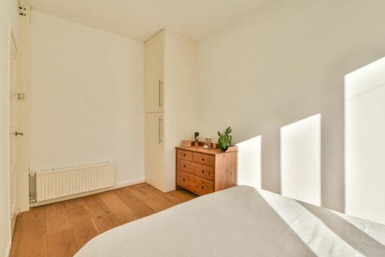
If you’re unsure about committing to bold colors or prefer a more subdued look, neutral colors (grays, beige, and off-white) can serve as a great base for your color scheme. Neutrals can create a clean, timeless, and sophisticated ambiance.
To avoid a flat or monotonous appearance when using neutrals or monochromatic color schemes, add texture through fabrics, floor coverings, and decorative accessories like throw pillows, wall art, or window treatments.
• Consult with Professionals or Seek Resources
While following these tips and guidelines can provide a solid foundation for your interior color scheme, seeking professional advice can offer additional guidance and expertise.
Hiring an interior designer or consulting with a color specialist at your local paint store can provide tailored recommendations for your space.
You can also visit websites like Benjamin Moore or Sherwin-Williams to explore color palettes, visualize your color schemes, and get expert tips and advice.
By implementing these tips and being mindful of color relationships, mood, lighting, and professional input, you can create a harmonious and aesthetically pleasing interior color scheme that reflects your style and brings your home to life.