Popular Color Schemes For Home Interiors. What Pros Say
Choosing the perfect color scheme for your home can be daunting, but it is crucial in creating an inviting and harmonious atmosphere. With countless color combinations and trends, picking the right palette that suits your aesthetics and enhances your home’s appeal is essential.
Popular color schemes for home interiors:
Popular color schemes for home interiors include neutral, monochromatic, analogous, and complementary. Neutral schemes create a calm atmosphere using shades of white, beige, and gray. Monochromatic schemes involve one color in various shades, while analogous schemes combine adjacent colors on the color wheel. Complementary schemes contrast colors directly opposite on the color wheel for a dynamic feel.

Discover the most popular color schemes for home interiors to breathe new life into your space. Read on as we delve into trendy palettes and creative combinations to elevate your home design. Don’t miss the chance to uncover your perfect color story!
Contents
- 1 Trending Home Interior Color Combinations
- 2 Top-Choice Colors for Interior Design
- 3 Interior Design Color Trends for 2023
- 4 Seven Essential Interior Design Color Schemes
Trending Home Interior Color Combinations
A well-thought-out color scheme can create the perfect atmosphere in your home, reflecting your personality and style.
• Neutral Color Schemes
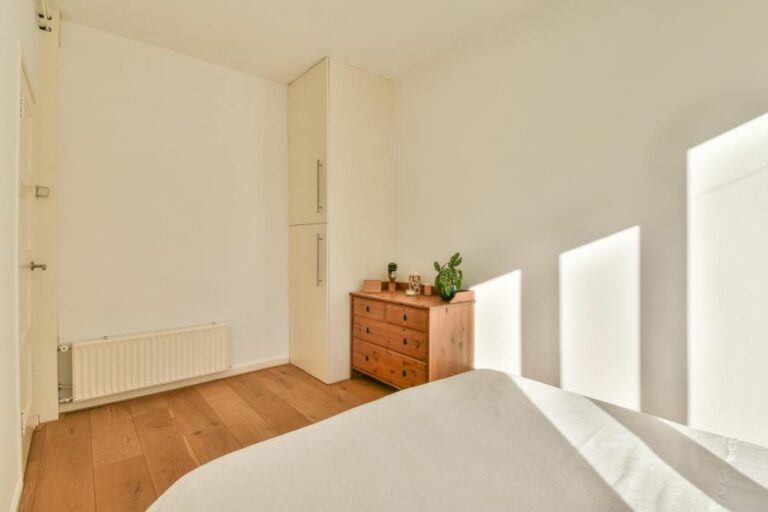
A neutral color scheme is ideal for creating a calm and serene environment. It typically encompasses shades of white, cream, beige, gray, and taupe. These colors are versatile and can be combined in various ways to achieve different effects.
– Advantages of Neutral Colors
- Timeless Appeal: Neutral colors never go out of style, ensuring your home’s interiors remain classic and elegant.
- Versatility: Neutrals can be combined with other colors or materials for a customized look. For example, adding a pop of color through accessories or artwork.
- Great for Small Spaces: Lighter neutral colors can make a small room appear larger.
– Recommendations
- Layer different shades of neutrals, such as a warm beige with cool gray tones, to add depth and interest to your space.
- If you want to include color in a neutral scheme, consider using muted, earthy hues. For example, sage green, dusty pink, or terracotta.
• Monochromatic Color Schemes
A monochromatic color scheme involves using one color in various shades and intensities. This approach creates a harmonious and visually appealing space. One of the most popular monochromatic schemes is an all-white interior, but other colors work well too.
– Advantages of Monochromatic Colors
- Visual Harmony: Using shades of the same color creates a cohesive and balanced look.
- Easy to Decorate: Since you’re working with a single color, it’s simpler to coordinate furniture, accessories, and other elements.
- Emphasizes Tones and Textures: A monochromatic scheme allows you to focus on texture and materials. This appreciation of detail adds richness to the interior.
– Recommendations
- Choose a color you genuinely enjoy, as it will be the primary hue for your space.
- Incorporate various textures and materials such as fabrics, metals, and woods to create visual interest and contrast.
- Combine different shades and intensities of your chosen color to avoid a flat or monotonous look.
• Analogous Color Schemes
An analogous color scheme consists of colors that are adjacent to the color wheel, such as blue, green, and yellow. This type of color combination creates a harmonious and calming atmosphere.
– Advantages of Analogous Colors
- Visually Appealing: Analogous colors are naturally pleasing to the eye, providing a sense of harmony.
- Flexible: You can adjust the balance and intensity of the colors to suit your preferences.
- Easy to Create: Since analogous colors are close on the color wheel, they are easy to identify and combine.
– Recommendations
- Stick to a maximum of three colors for a balanced and cohesive look.
- Choose one main color and use the others as accents.
- Adjust the intensity of the colors to suit the mood you want to create.
• Complementary Color Schemes
Complementary color schemes involve using colors directly opposite each other on the color wheel, such as blue and orange or purple and yellow. This type of scheme creates a dynamic and energizing atmosphere.
– Advantages of Complementary Colors
- Striking Contrast: The contrast between complementary colors creates a visually interesting and lively space.
- Accentuates Architectural Features: Using complementary colors can highlight unique architectural details in your home.
- Stimulating: The strong contrast can energize a space, making it suitable for rooms where activity occurs.
– Recommendations
- Use one color as the dominant hue and the other as an accent. This approach will create balance and avoid overwhelming the space.
- Ensure that the colors’ intensities are either similar or contrasting to achieve a harmonious effect.
- Consider using tints, shades, or tones of complementary colors if the standard hues feel too bold.
• Color Psychology in Home Interiors
Color can have a profound effect on your mood and emotions. When choosing a color scheme, consider how you want a room to feel or the energy you want to convey. Some associations with color psychology include:
- Blue: Calming, peaceful, and promotes focus
- Green: Soothing, restorative, and brings balance
- Yellow: Uplifting, energizing, and stimulates creativity
- Red: Passionate, bold, and stimulates appetite
- Purple: Luxurious, spiritual, and introspective
- Orange: Energizing, social, and inspires communication
For further information on color psychology, visit Color Matters.
• Final Thoughts
Ultimately, the color scheme you choose for your home interiors should reflect your personal taste and lifestyle. Be sure to consider factors such as room size, light exposure, and desired ambiance.
Experiment with different combinations, consult resources like this guide, and remember that you can always update your color scheme over time.
Top-Choice Colors for Interior Design
• The Power of Color in Interior Design
Color is an essential element in interior design, playing a significant role in how a space looks, feels, and functions. It can set the mood, create ambiance, and even influence the perception of room size. As such, selecting the right color is a crucial task in any interior decorating project.
• The Reigning Champion: Gray
According to various market research and surveys gathered from the interior design community, gray has emerged as the most popular color for interior decorating in recent years.
A versatile and timeless hue, gray is a neutral color that can easily blend with other shades and works well with various design styles. It has effectively replaced beige as the go-to neutral tone for contemporary interiors.
More on this trend can be found in Pantone’s annual Color of the Year announcement, which is renowned for setting the tone in many industries, including fashion, interior design, and industrial design.
In 2021, Pantone announced “Ultimate Gray” as one of the Colors of the Year, reflecting the hue’s popularity and validation in the design world. For more information on Pantone’s Color of the Year selection process and insights, visit their official website here.
– Advantages of Decorating with Gray
There are numerous reasons behind gray’s popularity in interior decorating. Some of these advantages include:
- Versatility: Gray can serve as a backdrop for a plethora of color schemes, whether monochromatic, contrasting, or complementary.
- Neutral Base: Gray’s neutrality allows it to work with various design styles, from minimalist and Scandinavian to industrial and rustic.
- Timelessness: Gray is a timeless color that can easily adapt to evolving trends and style shifts.
- Elegance: Gray is often associated with sophistication and class, making it a perfect choice for creating an upscale and refined atmosphere.
• Incorporating Gray into Different Rooms
– Living Room
In the living room, a soft gray is an excellent choice for walls, providing a neutral backdrop for various furniture styles and colors. Opt for lighter shades of gray for a bright, airy feel, while darker shades can add a sense of depth and coziness to the space.
To elevate the look, pair gray walls with bold accent colors, such as yellow or blue, which can bring energy and personality to the room. Accessories and soft furnishings, like throw pillows, rugs, and curtains, are also excellent avenues for experimenting with color.
– Kitchen
Gray has become a popular color choice for kitchen cabinets and countertops, as it offers a modern and sleek feel. Light gray cabinets can create an open, airy kitchen, while dark gray cabinets can evoke a sense of sophistication and depth.
Pairing gray cabinets with white countertops or vice versa is an effective means of achieving a clean, contemporary look.
– Bedroom
For a relaxing and calming environment in the bedroom, opt for gray as the dominant color. Combine different shades and textures of gray to add dimension and interest to the space.
To warm up the room and create a cozy ambiance, incorporate natural elements like wooden furniture or accent pieces in warm beige or brown tones.
– Bathroom
Gray is a popular color in bathroom design because of its ability to create a spa-like atmosphere. Both light and dark shades of gray can impart a sense of tranquility and elegance, complementing a variety of tile and fixture materials.
Combine gray with white or marble accents for a sophisticated and classic look, or use metallic accents to add a touch of luxury.
• Expert Recommendations for Decorating with Gray
- Select the right shade: Gray comes in a vast range of tones, from warm and taupe-leaning to cool and blue-leaning grays. Consider a room’s natural lighting, existing decor elements, and overall design style when selecting the best shade for your space.
- Mix textures: When using gray as the dominant color in a room, incorporate a variety of textures and materials to keep the space engaging and visually interesting.
- Adjust lighting: One potential drawback of using gray, especially in darker shades, is that it may cause a room to appear dim or closed-in. Proper lighting is crucial in mitigating this effect. Ensure that a room is well-lit, using both natural and artificial light sources.
- Add warmth: While gray is a versatile and sophisticated choice for interior decorating, it can sometimes feel cold or sterile. Incorporate warm-toned colors and materials, like wood or gold-tone accents, to balance the coolness and create a welcoming atmosphere.
In conclusion, gray has taken the interior design world by storm with its versatile, neutral, and timeless appeal. As the reigning most popular color for interior decorating, gray provides the perfect backdrop for countless design styles and color schemes.
By incorporating expert recommendations and understanding the nuances of decorating with gray, homeowners can create stylish, sophisticated, and effortlessly timeless interiors.
Interior Design Color Trends for 2023
The world of interior design is constantly evolving, and with each passing year, new trends emerge that change how we approach our living spaces. As we look forward to 2023, several color trends are set to dominate the interior design landscape.
• The Rise of Earthy Tones: Bringing Nature Indoors
A key trend in 2023 interior design is embracing natural, earthy tones. Driven by a growing desire for sustainable living and a closer connection with nature, these colors create warm, inviting spaces that reflect our increasingly eco-conscious mindset.
– Terracotta: A Timeless Classic
One color firmly in the spotlight is terracotta. This versatile hue has been a favorite throughout history and remains popular today, thanks to its warm, earthy feel. Pair terracotta with neutral tones such as white, cream, or beige for a harmonious and inviting atmosphere.
– Olive Green: A Taste of the Mediterranean
Olive green is another earthy tone gaining popularity in 2023. Hints of the Mediterranean can be found in this shade, which works particularly well in spaces with wooden elements. Blend olive green with natural materials such as wood, stone, or rattan for a laid-back, rustic ambiance.
• The Power of Neutrals: A Foundation for Creativity
With the increasing influence of minimalism and Scandinavian design, neutral colors continue to play a major role in interior design trends for 2023.
However, rather than being mundane, these versatile shades can form an ideal foundation for incorporating bold accent colors, creating a truly unique and personalized space.
– Warm Gray: The New Go-To Neutral
Gray has been a mainstay in interior design for some time, and in 2023, warm gray is set to take center stage. This sophisticated shade adds depth to a room, working well with both contemporary and classic furnishings. Pair warm gray with vibrant accent colors, such as mustard or teal, for a striking contrast.
– Soft White: A Fresh Canvas
White remains a timeless choice for creating a fresh and airy feel in any room. In 2023, soft white takes on renewed importance, as it provides the perfect backdrop for bolder color choices. Combine soft white with black details and a few statement accents to create a chic, contemporary look.
• Vibrant Accents: Embracing Individuality and Boldness
In a sharp departure from the minimalist tendencies of recent years, 2023 sees a resurgence in the use of bold, vibrant colors as accent pieces. In addition to providing a visual contrast, these shades can convey personality and creativity, making your living space an extension of your unique style.
– Pantone’s Color of the Year: Get Inspired
Each year, the Pantone Color Institute selects a color that they believe represents the zeitgeist of fashion, design, and popular culture. Paying attention to their choice is a valuable way to stay up-to-date with color trends and gain inspiration for your own interior design projects.
– Jewel Tones: A Touch of Elegance
One striking trend in 2023 is the prominence of jewel tones, such as emerald, sapphire, and ruby. These luxurious hues add depth and richness to any interior, creating a sense of opulence and sophistication. Consider incorporating jewel tones in small doses through upholstery, artwork, or decorative objects.
• In Conclusion: Crafting a Space that Reflects Your Vision
The color trends of interior design in 2023 are shaping up to be diverse and dynamic, offering opportunities to create exciting spaces that reflect evolving societal values and individual identities.
By combining earthy tones, neutral foundations, and vibrant accents, your home can become a stylish reflection of your personal taste and preferences. Don’t be afraid to experiment with different shades, textures, and materials – the future of interior design is as colorful and adventurous as you want it to be.
Seven Essential Interior Design Color Schemes
Creating visually appealing and harmonious spaces plays a significant role in interior design. A key aspect of achieving this balance in a room is the color scheme. With numerous options to choose from, it can be overwhelming when deciding on the ideal color palette.
However, understanding the seven primary color schemes in the world of interior design will help simplify the decision-making process.
• Monochromatic Color Scheme
As the name suggests, the monochromatic color scheme revolves around a single base color, using various shades, tints, and tones of that color to create a cohesive look. This approach provides an elegant and subtle visual effect, giving the space a sophisticated feel.
To successfully implement a monochromatic color scheme, it is vital to consider texture, pattern, and lighting to avoid monotony. Layering different materials, patterns, and lighting will add depth and prevent the space from looking flat.
Recommended application: Ideal for small spaces or when trying to create a calm and relaxing atmosphere.
• Analogous Color Scheme
The analogous color scheme involves selecting colors that are adjacent to one another on the color wheel. This type of arrangement creates a harmonious and soothing effect, as these colors often occur together in nature.
Remember to choose a dominant color and use the other colors as accents to avoid overwhelming the space. It’s also helpful to incorporate neutral shades such as white, beige, or gray to balance the overall look.
Recommended application: Works well in bedrooms and living room areas, where a calming ambiance is desired.
• Complementary Color Scheme
Complementary color schemes are created by choosing colors that are opposite each other on the color wheel. This dynamic pairing often leads to high contrast and bold designs, adding energy and vibrancy to a room.
It’s crucial to balance the room by incorporating neutral shades and applying bold colors sparingly to avoid overwhelming the space.
Recommended application: Perfect for spaces that need an energizing effect, such as home offices or playrooms.
• Split-Complementary Color Scheme
A split-complementary color scheme is similar to the complementary approach but uses two adjacent colors instead of the direct opposite shade. This strategy provides a balanced and visually appealing contrast in the space without the intensity of the complementary scheme.
When using this scheme, choose one primary color and use the two adjacent colors as accents to create a harmonious and diverse color palette.
Recommended application: Suitable for any space where a striking yet harmonious design is needed.
• Triadic Color Scheme
A triadic color scheme involves selecting three colors that are evenly spaced around the color wheel, forming an equilateral triangle. This arrangement typically results in a vibrant and balanced look, where each color can serve either as a dominant or an accent shade.
To achieve a successful triadic scheme, ensure to use of the colors in proportion and integrate neutral shades to prevent the space from looking chaotic.
Recommended application: Ideal for children’s rooms or areas that require a lively atmosphere.
• Tetradic (Double-Complementary) Color Scheme
A tetradic color scheme, also known as double-complementary, consists of two pairs of complementary colors, creating a rectangle on the color wheel. This approach can be challenging to balance but can result in a stunning and sophisticated design when done correctly.
To avoid overwhelming the space, choose one dominant color and use the other three shades as accents. Also, ensure to incorporate neutral shades for balance.
Recommended application: Works best in large rooms or open-concept spaces where multiple colors can be evenly distributed.
• Square Color Scheme
As the name implies, the square color scheme uses four colors that create a square on the color wheel. This arrangement is similar to the tetradic approach, with the main difference being the colors’ equal spacing.
Incorporating a square color scheme in a space requires careful balance, using one dominant color while the other three serve as accents. It is essential to consider the visual weight of each color and include neutral shades to avoid overwhelming the room.
Recommended application: Ideal for adventurous designers who want to create a striking visual impact in a space.
• Conclusion
A well-thought-out color scheme can significantly influence the interior design of a room. Understanding common color schemes is crucial when creating a visually appealing and harmonious space.
Experimenting with different combinations and applying them strategically will help transform your home into a beautiful and comfortable space.
For more in-depth information about color theory in interior design, consider visiting the Color Matters website, a great educational resource on all aspects of color in the design world.
Color Scheme | Description |
|---|---|
Monochromatic | A color scheme using only one hue, with its different values and intensities. |
Complementary | A color scheme using two colors that are opposite each other on the color wheel. |
Split-complementary | A color scheme using a base color and two colors adjacent to its complement on the color wheel. |
Analogous | A color scheme using three or more colors adjacent to each other on the color wheel. |
Triadic | A color scheme using three colors evenly spaced around the color wheel. |
Tetradic | A color scheme using four colors, which are two sets of complements on the color wheel. |
Neutral | A color scheme using various shades of gray or earth tones, such as beige, taupe, and brown. |