Vibrant Paint Colors For Indoor Spaces. What Pros Say
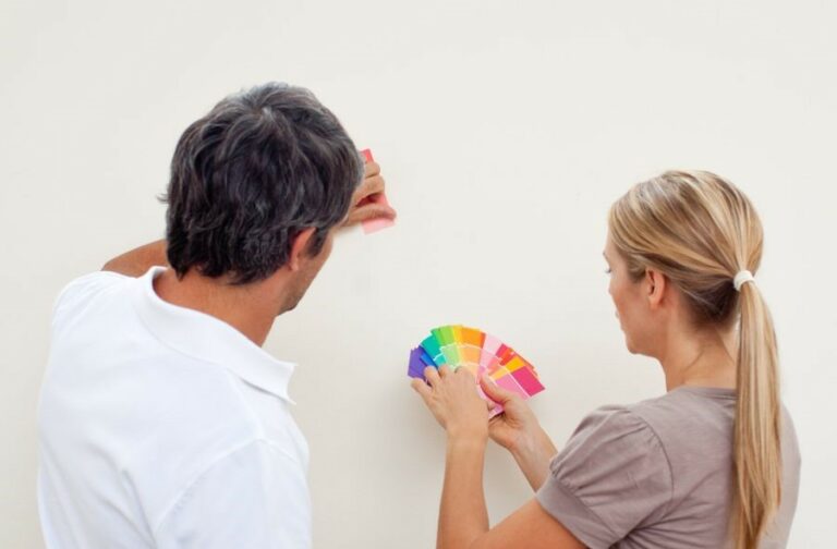
Are you ready to transform your home with a fresh splash of color? When choosing the perfect paint, a world of vibrant options is waiting to be explored! We’re here to guide you through selecting memorable and energizing hues for your indoor spaces. With our expert advice, you’ll have the confidence to create a stunning visual impact and a cozy atmosphere that truly reflects your style.
Vibrant paint colors for indoor spaces:
Vibrant paint colors can dramatically transform indoor spaces and boost mood. Warm options include electric orange, fiery red, and sunny yellow, while cool choices are electric blue, lime green, and deep purple. Balance vibrancy with neutrals, test colors on a small wall section, consider room size, complementary colors, and lighting for successful implementation.

Ready to turn your bland walls into a canvas of creative expression? Discover the power of vibrant paint colors to transform your indoor spaces into visually stunning, energizing retreats. Read on for expert tips on choosing the perfect palette and achieving flawless finishes.
Contents
- 1 Bold and Lively Paint Hues for Interior Spaces
- 2 Enhancing Room Brightness with Paint Color Choices
- 3 Selecting Paints to Amplify Space and Brightness
- 4 Defining the Most Vibrant Color Spectrum
- 5 Top Trending Colors for Interior Paint Jobs
- 6 Ideal Paint Colors to Boost Creativity in Spaces
Bold and Lively Paint Hues for Interior Spaces
• Introduction
As an expert in interior design, I know that selecting the perfect paint color for indoor spaces can be a daunting task. However, choosing a vibrant paint color can dramatically transform your space and boost your mood.
• The Power of Vibrant Colors
Vibrant paint colors can energize a room, making it feel more alive and inviting. Additionally, they can also help in creating a focal point or accentuating a specific area of the room. It is important to understand that each color has its own unique characteristics, which can affect how you feel in the space.
For example, colors like red, orange, and yellow are known to evoke energy and excitement, while colors like blue and green can create a calming atmosphere. Discovering the right balance can make all the difference in your indoor space.
– Warm Vibrant Colors
Electric Orange
A favorite in my experience, electric orange is a powerful and energetic color that can make a bold statement in any space. This hue is perfect for social areas like living rooms and dining areas where you want to create a welcoming environment.
To balance the intensity, consider pairing electric orange with neutral tones like white or gray.
Fiery Red
Red is a color that stimulates intense emotions ranging from love to anger. So, when used in moderation, it can create a bold and dramatic effect in indoor spaces. I recommend using fiery red as an accent color on a feature wall or in combination with cooler tones like blue or green to balance the intensity.
Sunny Yellow
Yellow is a highly versatile color that exudes warmth, positivity, and happiness. It works well in both small and large spaces and can be used in various shades to achieve different effects. For a lively and energetic feel, opt for a bright sunny yellow.
Conversely, a more subdued shade of yellow can create a cozy and inviting environment.
– Cool, Vibrant Colors
Electric Blue
One of my favorite vibrant cool colors is electric blue. This striking color has the potential to create an invigorating and refreshing ambiance in any space. I recommend using electric blue as a feature wall color or in combination with white or other neutral shades for a well-balanced look.
Lime Green
Lime green is a zesty and refreshing color that can instantly energize any room. This color works exceptionally well in kitchens and bathrooms where you want to evoke cleanliness and freshness. Pair lime green with white or gray for a harmonious and calming effect.
Deep Purple
Deep purple is a regal and sophisticated color that can create a dramatic and luxurious feel in indoor spaces. This bold color works well in bedrooms, living rooms, or dining rooms where you want to make a statement.
Use deep purple in combination with lighter shades of purple, white or gray for a rich and elegant look.
• Tips for Using Vibrant Colors in Indoor Spaces
- Testing the color: When choosing a vibrant paint color, always test it on a small section of the wall first. This will give you a better understanding of how the color will look when it is applied to a larger area.
- Consider the room size: Vibrant colors can make a small room feel even smaller. In such cases, opting for a single accent wall or using vibrant colors as accents through accessories and furnishings may be a better choice.
- Balance with neutrals: A vibrant color needs to be balanced with neutral shades like white, gray, or beige to prevent it from becoming overwhelming.
- Complementary colors: Pairing a vibrant color with a complementary color can create a visually pleasing and balanced environment. For example, pairing orange with blue or purple with yellow. Refer to a color wheel to determine the best complementary colors for your chosen shade.
- Lighting: The lighting in a room can greatly affect how a color appears. Make sure to consider both natural and artificial lighting when selecting a vibrant paint color.
• Conclusion
In conclusion, vibrant paint colors can dramatically transform your indoor space and enhance your overall mood. By understanding the characteristics of each color and using the recommended tips, you can successfully incorporate vibrant colors into your home’s interior design.
Don’t be afraid to experiment and make a bold statement; the results can be truly amazing.
Enhancing Room Brightness with Paint Color Choices
A well-chosen paint color can radically transform any room in your home, not only elevating its visual appeal but also making it appear brighter and more spacious.
As an experienced professional in interior design, I’ve often found that choosing the right paint color involves careful consideration of a room’s orientation, natural light distribution, and room function.
• Cool and Light Neutral Paint Colors
Neutral colors are known for their versatility and timeless elegance. These hues, which include grays, taupes, and beiges, can significantly enhance the brightness of a room when used in muted, lighter tones.
– Soft Grays
Soft grays, particularly those with bluish undertones, can create a serene and sophisticated backdrop while reflecting light effectively. Light gray shades work exceptionally well in both modern and traditional settings, complementing other colors or allowing statement pieces to stand out.
Sherwin-Williams’ Light French Gray is a popular choice within this category.
– Gentle Taupes
Taupe, a blend of brown and gray, lends an earthy, warm ambiance to spaces. Light taupe shades partner well with different color schemes, readily reflecting light in rooms with large windows or abundant natural light sources. Benjamin Moore’s Balboa Mist is an excellent example of a lighter taupe.
– Creamy Beiges
Subtly warm beiges instill rooms with a cozy and inviting atmosphere while helping to brighten spaces. Choose a beige paint with a touch of yellow to create a cheerful environment or a beige with reddish undertones for added warmth. Try Behr’s Navajo White for a classic, creamy beige.
• Vibrant Paint Colors
If you’re looking for paint colors to energize a room and make it appear brighter, consider opting for more vibrant hues.
– Canary Yellow
Yellow is synonymous with sunlight and warmth, making it an excellent choice for adding brightness to any room. A canary yellow provides a bold yet cheerful option that enhances natural light and visually expands your room. Valspar’s Morning Sun is a perfect example of this vibrant yellow shade.
– Sky Blue
Sky blue hues evoke feelings of fresh, open spaces and are particularly effective in enhancing brightness in north-facing rooms that receive limited natural light. The calming effect of sky blue pairs beautifully with white and light wood accents. Farrow & Ball’s Skylight is a popular, refreshing option.
– Coral
This blend of pink and orange injects a playful, warm glow into spaces while reflecting light to make rooms appear brighter. Coral paint colors suit living areas, bedrooms, and bathrooms, working harmoniously with both dark and light furnishings.
Sherwin-Williams’ Coral Reef is an excellent choice for those seeking a lively, radiant atmosphere.
• Factors to Consider When Choosing a Paint Color
Considering the relationship between the paint color and various room features is essential for achieving optimal results. Here are a few factors to bear in mind:
– Natural Light
Rooms with abundant natural light will find their brightness enhanced with cool or vibrant paint colors like greens, blues, and yellows. For darker, north-facing rooms or those with limited light, it’s best to rely on warm neutrals or intense, saturated colors to maximize brightness.
– Room Orientation
South- and west-facing rooms naturally receive more light, so cooler paint colors suit these spaces well. East- and north-facing rooms can benefit from warmer paint colors that counterbalance the cooler light they receive.
– Room Size
Remember that lighter, cool colors will help make a small room appear larger and brighter, while dark colors can make a large room feel cozier and more intimate. For the best effect, pair cool or light colors with white or off-white trim.
– Room Function
Lastly, consider the room’s function when choosing your paint color. Different colors evoke different emotions and energies, so select colors that will enhance and elevate the desired atmosphere of each specific room.
With careful consideration of paint colors and their interaction with your room’s unique features, you can significantly transform your space, making it look brighter, more vibrant, and more welcoming. Happy painting!
Selecting Paints to Amplify Space and Brightness
The right paint colors and techniques can create the illusion of a more spacious and brighter room.
• The Power of Light Colors
Light colors are excellent for creating an open and bright atmosphere. They reflect light, which gives the impression of a larger and airier space. Among the most recommended light colors for room expansion and brightness are:
– White
White is a classic choice that never goes out of style. It reflects light better than any other shade, instantly making a room feel bigger and brighter.
Opt for an off-white or slightly warm white to avoid a sterile or cold vibe. A great source for selecting the right white shade for your space is the Benjamin Moore website.
– Soft Neutrals
Soft neutrals like beige, cream, and light grey create a calming and inviting vibe in a room. These hues work well with most types of decor and furniture and can be easily complemented with colorful accents for a more vibrant touch.
– Pastels
Pastel shades such as light blue, pale green, and blush pink are not only trending in interior design but they are also known for their ability to expand and brighten up spaces. These colors bring a subtle pop of color without overwhelming the room.
• Opt for Monochromatic Color Schemes
Monochromatic color schemes consist of different shades, tints, and tones of a single base color. These schemes can be an effective way to create visual flow and continuity, which enhances the perception of space.
For example, painting walls, trim, and furniture in varying shades of light grey can make a room look more spacious and cohesive.
• Use Colors with High Light Reflectance Values (LRV)
The Light Reflectance Value (LRV) is a number that represents the ability of paint color to reflect light. The higher the LRV, the more light the paint color will reflect, making the room feel larger and brighter.
When selecting a paint color, consider looking for LRV information on the paint swatches or consult with the paint manufacturer. You can also learn more about LRV and its impact on room brightness from this informative article by the National Institute of Building Sciences.
• Enhance Vertical Space with Paint Techniques
The following paint techniques can help create the illusion of higher ceilings and taller walls, effectively making your room look bigger and brighter:
– Paint the Ceiling a Lighter Shade
Paint the ceiling a shade or two lighter than the wall color to draw the eye upwards and create the impression of taller walls.
– Use Vertical Lines
Vertical lines can give the illusion of height and elongate a room. Consider using a paint technique that incorporates vertical lines, such as painting vertical stripes or installing vertically-oriented wallpaper.
– Paint an Accent Wall
Choose your room’s longest or tallest wall and paint it in a slightly darker shade than the rest of the walls. This will add depth and make the room appear more spacious.
• Additional Tips for Enhancing Space and Brightness
While paint color and technique are significant factors in making a room look larger and brighter, the following tips will help you achieve an even more polished and expansive appearance:
– Minimize Visual Clutter
Keep decor and furniture minimal and well-organized to avoid overwhelming the space. Stick to cohesive and streamlined designs for an uncluttered look.
– Use Mirrors
Mirrors reflect light and create the illusion of depth, making a room appear larger and brighter. Hang a large mirror on a focal wall, or arrange smaller mirrors to achieve a similar effect.
– Utilize Natural Light
Maximize natural light by using light-colored and non-intrusive window treatments like sheer curtains or blinds. Arrange furniture to avoid blocking the flow of natural light.
– Opt for Sleek Furniture
Choose furniture that is scaled appropriately for the space and has a slim profile. Opt for glass or lucite tables to create the illusion of more open floor space.
In conclusion, utilizing the right paint colors and techniques can make a significant impact on the overall perception of space and brightness in your room.
Choose light colors with high LRV, incorporate monochromatic color schemes, and implement creative paint techniques to create a room that appears larger, brighter, and more inviting. Combine these tips with thoughtful decor and furniture choices for the most effective and cohesive results.
Defining the Most Vibrant Color Spectrum
Vibrant colors are those that are bright, bold, and high in saturation, creating strong visual impact and grabbing attention. They are lively and energetic, and convey a sense of warmth and excitement, making them perfect for adding visual interest to any design or environment.
• Primary Colors: The Basis of Vibrant Shades
– Red: Bold and Passionate
As one of the primary colors, red immediately catches your eye and is often associated with passion, love, and anger. This bold and vibrant color can be used to create a sense of urgency or to encourage action.
For example, many businesses choose red for their logos or call-to-action buttons as it stimulates excitement and motivation.
– Blue: Dynamic and Trustworthy
Another primary color, blue, is considered to be a dynamic and vibrant color. It is associated with feelings of trust, stability, and dependability. This makes it a popular choice for companies in industries like banking and technology.
When using blue to create a vibrant look, opt for brighter shades such as royal or cobalt blue instead of the more muted, conservative tones.
– Yellow: Cheerful and Energetic
The final primary color, yellow, is often seen as the most vibrant and energetic of all colors. It evokes happiness, optimism, and warmth – making it an excellent choice for creating a cheerful atmosphere.
This color can be used as an accent in designs or in larger areas to create a sunny, uplifting environment. Keep in mind that using too much yellow can be overwhelming, so be sure to balance it with other colors.
• Secondary Colors: Expanding the Vibrant Palette
– Green: Invigorating and Natural
As a secondary color combining blue and yellow, green can also be considered vibrant. Bright shades of green, such as lime or emerald, can be used to create an invigorating and fresh atmosphere in any space.
Additionally, green is closely associated with nature, making it a great choice for promoting eco-friendliness and sustainability.
– Orange: Warm and Uplifting
Orange, another secondary color derived from mixing red and yellow, is a warm and uplifting color. It is considered vibrant and high-energy – making it ideal for environments that promote creativity, communication, and collaboration.
If you want to motivate and inspire, use bright shades of orange in your designs or interiors.
– Purple: Luxurious and Mystical
Lastly, purple is considered a vibrant color when used in its brighter shades, like violet or magenta. Purple combines the excitement of red and the calmness of blue, making it versatile and rich. It is often used to convey luxury, royalty, and spirituality.
Utilizing this color in your design can create a sense of depth and sophistication.
• Combining Vibrant Colors: Tips and Recommendations
– Use Contrast and Balance
To make the most of vibrant colors, use a combination of contrasting hues to create a visually striking design. Pair bright shades with complementary colors for maximum impact. For instance, red and green, blue and orange, or yellow and purple make excellent vibrant combinations.
However, it is essential to maintain balance and avoid overwhelming your audience with too much brightness. Using vibrant colors sparingly as accents or pairing them with neutral shades like white, black, or gray can create harmony within your design.
– Utilize Color Psychology
Understanding the effect of different colors on human emotions and perceptions can help you make more informed decisions when choosing vibrant colors for your designs. For example, red may evoke feelings of passion and excitement, while blue conveys trust and stability.
Align your color choices with the message you want to convey and consider the emotional impact on your audience.
– Consider the Environment and Context
When using vibrant colors, it is crucial to factor in the environment and context in which the colors will be displayed. Bright colors can appear even more intense under direct sunlight, while dim indoor lighting may dull their vibrancy.
Additionally, consider cultural differences in color meanings and preferences when designing for an international audience.
• External Resources
For further information on using vibrant colors effectively, visit the Pantone Color Institute, a leading source of color expertise and guidance for designers and creatives.
In conclusion, vibrant colors, such as red, blue, yellow, green, orange, and purple, can significantly impact the overall look and feel of any design or environment. They are perfect for creating a sense of excitement, energy, and warmth and drawing attention.
Utilize these colors wisely, considering their psychological effects and context, to create a visually striking and impactful design.
Top Trending Colors for Interior Paint Jobs
As an experienced professional in the world of interior design and painting, I’ve seen countless trends come and go over the years. However, some colors have managed to maintain their popularity and appeal for homeowners and interior decorators alike.
• Neutral and Earth Tones
One category of colors that stands the test of time is neutral and earth tones, which encompass a wide range of hues that create a warm, inviting atmosphere.
– Off-White
Starting with the lightest option, off-white, like Benjamin Moore’s Simply White, remains a homeowner favorite for its versatility and ability to create a clean, open feel. Off-white also makes a great base color for those who like to layer on bolder accents or add dimension with varied textures.
– Beige
Beige is another neutral shade that often finds favor with homeowners thanks to its timeless appeal and ability to coordinate well with most design schemes. Picking the right beige, like Farrow & Ball’s Joa’s White can create a sense of warmth and elegance in any space.
– Greige
A trending favorite in recent years, greige (a combination of gray and beige) offers a versatile compromise between cool and warm tones. Sherwin-Williams’ Repose Gray is a popular choice, blending seamlessly with a variety of decors and providing a sophisticated backdrop for many spaces.
• Cool Tones
From soft blues to rich grays, cool-toned paints introduce a serene and calming atmosphere into your home.
– Pale Blue
Pale blue hues, like Farrow & Ball’s Parma Gray, can make a room feel fresh, tranquil, and inviting. This color works well in bedrooms and bathrooms, where creating a soothing, calming atmosphere is often desired.
– Gray
A variety of gray shades continue to be popular for those seeking a sleek, contemporary aesthetic. For a light gray option, Benjamin Moore’s Classic Gray is an excellent choice that can create the illusion of a larger space while maintaining a sense of coziness.
If a deeper hue is desired, try Sherwin-Williams’ Dovetail.
• Bold Colors
For those unafraid of making a statement, bold colors can introduce energy and personality into a living space.
Instead of choosing a traditional black or dark gray, consider a rich navy blue such as Benjamin Moore’s Hale Navy for a sophisticated and bold statement. Navy blue pairs well with crisp whites, as well as metallic accents.
– Deep Green
Deep green shades like Farrow & Ball’s Studio Green evoke a sense of nature, bringing the outdoors in. This color pairs beautifully with wood tones, earthy neutrals, and metallics for a luxurious yet grounded atmosphere.
• Tips for Choosing the Right Paint Color
When selecting a paint color, it’s essential to test out different shades in the room you plan to paint. Different lighting conditions throughout the day can significantly affect the way a paint color appears.
Be sure to choose the right paint finish for your project, considering factors like durability, washability, and overall paint performance.
In summary, popular indoor paint colors span a wide spectrum, from classic neutrals to vibrant, bold hues. By considering the desired atmosphere, lighting conditions, and personal style preferences, you can find the perfect paint color to transform your space.
Rank | Color |
|---|---|
1 | Classic Gray |
2 | Soft White |
3 | Light Blue |
4 | Greige |
5 | Beige |
6 | Sage Green |
7 | Pale Pink |
8 | Light Lavender |
9 | Muted Yellow |
10 | Soft Gray |
Ideal Paint Colors to Boost Creativity in Spaces
• The Impact of Color on Creativity
Choosing the right color to paint a creative space can have a significant impact on your mood, productivity and overall level of creativity.
There is a strong connection between colors and emotions, which extends to the workplace and creative spaces. According to a study conducted by the University of Texas, color can greatly affect employee performance and the overall atmosphere of a workspace.
Therefore, it is essential to understand what colors work best for creative spaces and how they can positively impact those using them.
• Warm Colors vs. Cool Colors
– Warm Colors for an Energetic Atmosphere
Colors such as red, orange, and yellow are considered warm colors. They can evoke feelings of optimism, energy, and creativity. These colors can be particularly effective in areas where brainstorming and physical activity take place, as they can help stimulate the mind and body.
However, it’s important to use warm colors in moderation, as they can also be overly stimulating and possibly lead to restlessness or anxiety.
– Cool Colors for Calm Atmosphere
Cool colors, on the other hand, include blue, green, and purple. These colors are usually associated with calming and soothing effects. They can encourage concentration and support a relaxed environment in a creative space.
Blue is often cited as the most productive color, as it can lower heart rate and reduce stress, making it an ideal choice for promoting mental focus. However, you should avoid using too much of a single cool color as it may make the space feel too cold or uninviting.
• Recommended Colors For Creative Spaces
– Blue: The Intellectual Powerhouse
As mentioned earlier, blue promotes mental focus and can help foster an environment that nurtures critical thinking and problem-solving skills. If your creative space requires a high level of concentration and attention to detail, blue could be the best choice.
This color has been observed to boost productivity and efficiency in workplace settings, making it ideal for creating spaces that call for analytical and intellectual prowess.
– Green: The Naturalistic Muse
Green represents nature, growth, and renewal. This color has a positive effect on mood and can create a sense of refreshment and balance in a creative space. For those who find inspiration in nature, green can help bring a sense of the outdoors into the workspace.
It is also believed to improve reading comprehension and reduce eye strain, making green an excellent choice for writers or those who work long hours in front of a computer screen.
– Yellow: The Vibrant Energizer
Yellow is the color of sunshine, happiness, and optimism. It can uplift the mood and stimulate creativity, making it a perfect addition to creating spaces that require energy and enthusiasm. Adding touches of yellow in a room can result in an environment that feels warm, lively, and inviting.
However, it’s essential not to overdo it, as an abundance of yellow might lead to feelings of agitation or restlessness.
– Purple: The Visionary Stimulator
Purple combines the tranquility of blue with the energy of red, resulting in a color that stimulates imagination and creativity.
This color is often associated with sophistication, wealth, and luxury, making it an excellent choice for creating environments that involve artistic endeavors, such as design studios or art galleries. In addition to enhancing creative thinking, purple can also provide a calming and soothing effect.
• Implementing Color in Your Creative Space
– Balance and Harmony
The key to using color effectively in a creative space is balance. Avoid dominating the space with a single color, as this could create an overwhelming or monotonous environment. Instead, consider using a combination of colors that complement each other and create a harmonious atmosphere.
– Accent Walls and Accessories
One way to implement color is by painting an accent wall. This can allow you to introduce a bold color without overwhelming the entire room.
Accessorizing your creative space with color-coordinated objects, such as decorative pillows, artwork, and office supplies, can help create a cohesive and visually appealing environment.
– Consider the Lighting
The way colors appear in space can change dramatically depending on the type and amount of lighting available. Before choosing a color, examine how natural and artificial light impact the desired hue and adjust the shade accordingly.
In conclusion, the optimal color for a creative space depends on the specific needs and preferences of those using it.
However, striking a balance between warm and cool colors, and selecting hues that encourage focus, creativity, and positive emotions, can lead to a more productive and inspiring environment.
Color | Description | Effect on Creativity |
|---|---|---|
Blue | Represents calmness and stability | Facilitates focus and communication |
Green | Symbolizes growth and renewal | Encourages innovation and creative thinking |
Yellow | Associated with energy and happiness | Boosts mood and stimulates the mind |
Orange | Represents warmth and enthusiasm | Invokes excitement and creative energy |
Purple | Symbolizes wealth and imagination | Nurtures introspection and creativity |