Choosing Paint Colors For Cramped Areas, 25 Things You Should Know
Are you struggling to make the most of a small, cramped space in your home? Picking the right paint colors can drastically transform and elevate the overall appearance of such areas. With my expertise and a keen eye for detail, I can guide you in choosing the perfect hues to brighten up confined spaces, creating the illusion of a more open and airy environment.
Choosing paint colors for cramped areas
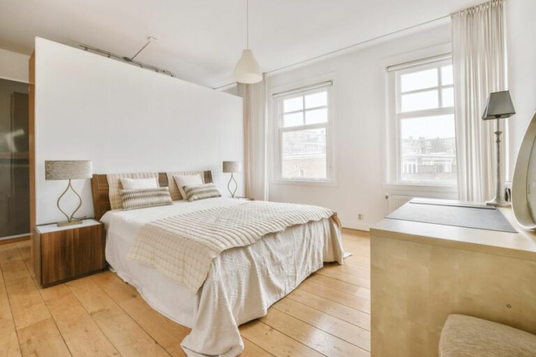
Opt for light or neutral paint colors such as white, cream, or light gray to make cramped spaces appear larger. These colors create an open and airy feel while reflecting natural light. Use a matte finish for walls and a glossy finish for trim and accents. Maximize natural lighting and incorporate various artificial light sources. Emphasize vertical space with design elements and storage solutions.

Cramped spaces can feel larger and more inviting with the right paint color choices. In this article, we’ll reveal the best hues to expand your small area’s visual appeal and create a welcoming ambiance. Don’t let square footage limitations hold you back – read on to transform your tiny space!
Contents
- 1 Selecting Paint Colors for Small Spaces
- 2 Picking a Paint Color for Connected Rooms
- 3 Paint Appearance in Large Spaces: Lighter or Darker?
- 4 Cool vs. Warm Colors: Best Choice for Small Rooms
- 5 Light or Dark Paint: Ideal Option for Small Rooms
Selecting Paint Colors for Small Spaces
Does your room feel small and cramped? One surefire way to make cramped areas look bigger and more spacious is by choosing the right paint colors.
• The Importance of Light and Color
Colors can greatly impact our emotions and how we perceive a space. Light colors can make a small room appear brighter and larger, while dark colors can make the area seem smaller and more closed in.
When choosing paint colors for cramped areas, consider the impact of different colors on the overall perception of the space.
– Light and Neutral Colors
For cramped areas, it is best to choose colors that are light or neutral. Light colors, such as white, cream, or light gray, can create a more open and airy feel in a small space.
Additionally, these colors provide a simple, clean canvas that can easily be accented with bold patterns and textures in your furniture or accessories. Lighter colors will also help to reflect natural light, making rooms feel brighter and more open.
– Avoid Dark Colors
On the other hand, dark colors such as navy or black can make small spaces feel even more confined. However, they can be used as accents on furniture or accessories to create depth in the room.
• Consider the Type of Paint Finish
The finish of your paint, such as matte, satin, or glossy, will directly affect your perception of the room’s size. Matte finishes are typically preferred for small spaces, as they don’t reflect light as much and create a soothing, cozy atmosphere.
On the other hand, glossier finishes will make a room appear larger and brighter by reflecting light.
– Matte Finish for Walls
It is recommended that small rooms use a matte or flat paint finish for their walls. This type of finish absorbs light, which can make the space feel softer, more relaxed, and more intimate. This is especially useful for cramped areas where a glossy finish may overwhelm the space.
– Glossy Finish for Trim and Accents
A glossy or semi-gloss finish can work well for trim, baseboards, and doorframes in small spaces. By reflecting light upon these areas, you can create the illusion of a larger, brighter room.
• Accentuating Architectural Features
Maximizing the use of available space in a small room is essential. One way to do this is by emphasizing the room’s architectural features.
By painting features such as crown molding, built-in shelves, or wainscoting in a slightly contrasting color, you can draw attention to these areas and create visual depth within your space.
• The Role of Lighting in Small Spaces
Lighting plays a crucial role in how we perceive a space. Therefore, it’s important to understand the type and quality of light in your cramped area. Ensure that the room has adequate natural light and supplement it with artificial lighting to create a brighter, more spacious feel.
For more information on the effects of lighting on paint colors, check out the United States Environmental Protection Agency’s lighting tutorial.
– Natural Lighting
Maximizing natural light is key to making small spaces appear bigger. Consider replacing heavy curtains with lighter, sheer options or using blinds that can be adjusted to allow more sunlight into your room.
When choosing paint colors for small spaces, remember that they will appear different depending on the lighting conditions.
– Artificial Lighting
In addition to natural light, incorporating various forms of artificial lighting can help make cramped areas feel more spacious.
Use a mixture of ambient, task, and accent lighting to create a balanced, well-lit environment. Select bulbs that emit a soft, warm glow, as cool; harsh light can make a space feel more confined.
• Think Vertical
Another effective way to make a cramped area look larger is to draw the eye upwards. You can do this by painting your ceiling a lighter color than your walls, adding vertical lines or patterns to your walls, or selecting tall, slender furniture.
Vertical storage solutions, such as shelves or bookcases, can also make the most of your limited space.
• Final Thoughts
In conclusion, choosing paint colors for cramped areas requires careful consideration of the color, paint finish, lighting, and room arrangement.
Stick to light, neutral colors to create a more open and airy feel while using a matte finish on walls and a glossy finish on trim and accents. Be sure to maximize natural lighting and utilize various types of artificial light sources for a well-lit room.
Finally, use design elements and storage solutions that maximize vertical space for an optimal interior layout. By following these expert recommendations, you can transform your cramped area into a more comfortable, spacious living environment.
Picking a Paint Color for Connected Rooms
As an experienced decorator, I know that choosing the perfect paint color can be daunting, especially when it comes to adjoining rooms.
• Understanding Color Theory
Before diving into specific color choices, it’s essential to have a basic understanding of color theory. Colors can be grouped into three categories, which can help guide your decisions:
- Primary colors (red, blue, and yellow) are the foundation of all other colors.
- Secondary colors (orange, green, and purple) are created by mixing two primary colors.
- Tertiary colors are formed by mixing primary and secondary colors, resulting in a range of more nuanced hues.
By understanding how colors are formed and relate to one another, you’ll be better equipped to make informed decisions when selecting paint colors.
Color Wheel is an excellent resource if you’re looking for more information on color theory and want to expand your understanding further.
• Consider the Flow of Your Space
When choosing paint colors for adjoining rooms, it’s important to consider how the space flows and how the eye travels through it. The goal is to make your rooms look connected and cohesive rather than disjointed and visually jarring.
To achieve this, consider using one of the following strategies:
– Use a Monochromatic Color Scheme
A monochromatic color scheme uses a single color in varying degrees of intensity and saturation throughout the space. This creates a sense of unity and flow, as a single hue ties together every room.
To do this effectively, select a base color, and use lighter or darker shades of that color for each adjoining room. For example, if you choose blue as your base color, you might use a pale blue for your living room and a slightly darker blue for your dining room.
– Apply Analogous Colors
Analogous color schemes utilize colors that are adjacent to one another on the color wheel. These colors tend to be harmonious and pleasing to the eye, as they share similar undertones.
For example, you might choose three adjacent colors, such as green, blue, and purple, for adjoining rooms. This will create a cohesive and visually interesting flow throughout the space.
– Choose Complementary Colors
Complementary colors are those that sit opposite each other on the color wheel, such as Blue and orange or Red and green. When used together, these colors provide a high-energy, dynamic look that can be perfect for adjoining rooms.
However, be cautious when using complementary colors, as too much contrast can be overwhelming. The trick is to balance one color’s boldness with another’s softness for an effective and visually appealing design.
• Factor in Architectural and Decorative Elements
When selecting paint colors, consider the architectural and decorative elements present in your rooms. For example, if you have floor-to-ceiling windows or a fireplace, these often serve as focal points that you’ll want to highlight.
Be mindful of the flooring, furniture, and other decorative elements in the room. Consider choosing paint colors that complement or contrast with these elements rather than those that will clash.
• Test Paint Samples
As a decorating professional, I always recommend testing paint samples before committing to a particular color. This ensures that you can see how the color looks in your space, under different lighting conditions, and against your existing furniture and decor.
It’s also a good idea to view samples at different times throughout the day, as the room’s light will change, which may affect the color’s appearance.
• Emphasize Vertical Gradation
A final tip for selecting paint colors in adjoining rooms is to create a sense of vertical gradation. This involves picking lighter colors as you move up the walls and working towards darker colors as you move down.
This technique is particularly useful in open-concept spaces or multi-story rooms, where the eye is drawn upward. It can help create a sense of cohesion and prevent an overwhelming sensation when moving between rooms.
By following these expert tips and strategies, you’ll be well on your way to choosing the perfect paint colors for your adjoining rooms. Remember to consider the flow of the space, complement architectural and decorative elements, and test paint samples before committing.
With a bit of careful planning and attention to detail, you’ll create a harmonious and visually stunning home that you’ll be proud to show off.
Paint Appearance in Large Spaces: Lighter or Darker?
When choosing the perfect paint color for your home, you may wonder if the color will look lighter or darker when applied to a larger area. This is a common dilemma faced by homeowners, interior designers, and contractors alike.
Lighting, surface texture, and multiple layers of paint are factors that influence the appearance of paint color on a surface.
• The Effect of Lighting on Paint
One of the primary factors to consider when choosing a paint color is the lighting in the room where it will be applied. Natural light, artificial light, and the direction of the light source can all impact how a paint color appears on a larger surface.
– Natural Light
Natural light typically represents the paint color more accurately and consistently. The orientation of your room also affects color perception.
A north-facing room tends to have cooler, bluer light, which can make colors appear darker. A south-facing room with warmer light can make colors appear lighter and more vibrant.
– Artificial Light
Different types of artificial light can also change the appearance of paint colors.
For instance, incandescent bulbs produce a warm, yellowish light that can make colors appear more intense. In contrast, fluorescent lights tend to cast a cooler, bluer light that can mute warm colors and make cooler colors appear brighter.
– Direction of Light
The direction of the light source and the angle at which it hits the surface can also impact color perception. The light directly shining on a surface will make the paint color appear lighter, while light hitting the surface at an angle will create shadows, making the color appear darker.
• Surface Texture and Its Impact on Paint Color
Another factor to consider when choosing a paint color is the texture of the surface to which it will be applied. A smooth surface will reflect more light, making colors appear lighter, while a textured surface will absorb more light and make colors appear darker.
Moreover, a porous surface (such as unfinished wood or an unpainted wall) will absorb paint and require multiple coats, which can also affect the final appearance of the color.
• The Influence of Multiple Layers of Paint
The number of coats of paint applied to a surface can also impact the final color. Multiple coats of paint can often result in a deeper, richer color. However, this is not always the case, as some colors may appear lighter with additional coats due to increased reflectivity.
• Expert Tips for Choosing the Right Paint Color
To ensure that you choose the perfect paint color for your space, consider the following expert recommendations:
- Test the paint color in your desired space – It is essential to test paint samples on a specific surface and under the specific lighting conditions where the paint will be applied. This will help you see how the color will actually look in the space, accounting for changes in natural light throughout the day and the impact of artificial light sources.
- Use larger paint samples – Rather than relying on small paint chips, consider using larger paint swatches or applying samples directly to the wall to get a better sense of how the color will look in your space.
- Consider the room’s purpose, architectural features, and decor – Choose a paint color that complements the style and purpose of the room, as well as the surrounding furnishings and decorative elements.
- Consult a professional – If you’re struggling to find the perfect paint color, consulting with an interior designer or a color consultant can be a valuable investment. These professionals have extensive experience and expertise in determining the best paint colors for different spaces and lighting conditions.
• Conclusion
Ultimately, the appearance of paint color in a large area depends on various factors, such as lighting, surface texture, and the number of paint layers applied. Understanding these factors and following expert tips will help you choose the perfect paint color for your space.
For more information on paint colors and their effects in different spaces, consider visiting the Paint Quality Institute or consulting with a professional in your area.
Cool vs. Warm Colors: Best Choice for Small Rooms
The choice of colors for a small room can greatly affect its feel and ambiance. Cool and warm colors both have advantages and challenges when incorporated into a small room’s color scheme.
• Cool Colors: Expanding the Space
Cool colors, such as blue, green, and violet, are typically considered more suitable for small rooms because they give the illusion of depth, making the room appear larger. By receding from the viewer, cool colors create a sense of space and openness.
– Advantages of Cool Colors
- Creates a calming atmosphere: Cool colors are known for their calming effects on the mind. They work well in spaces where you need to relax and unwind, such as bedrooms and bathrooms.
- Increases perception of space: By making the room feel more spacious, cool colors can make a small space more comfortable and easier to navigate.
- Complements natural light: Cool colors work well with natural light, creating a bright and airy feel. Rooms with cool color schemes often feel more connected to the outdoors.
– Challenges of Cool Colors
- Can feel cold: Cool colors can make a space feel chilly, especially in rooms with little natural light. However, this can be countered by using warmer furnishings and accessories.
- Limited range: While cool colors can create a refreshing atmosphere, it’s important not to go overboard. Combining many cool colors can make the room feel disconnected and overly “sharp.” So, it’s essential to strike a balance in your color choices.
• Warm Colors: Inviting and Cozy
Warm colors, on the other hand, such as red, orange, and yellow, bring an inviting and cozy effect. These colors can make a small room feel intimate and welcoming.
– Advantages of Warm Colors
- Creating a cozy space: Warm colors make a space feel intimate and inviting, perfect for areas where you want to socialize and relax, such as living rooms or dining rooms.
- Stimulating the senses: Warm colors are known for their ability to stimulate the senses and create a lively atmosphere. They’re excellent for injecting energy into dull or lifeless spaces.
- Complements artificial lighting: Warm colors work well with artificial lighting, creating a cozy ambiance during evenings or in rooms with little natural light.
– Challenges of Warm Colors
- Can feel overwhelming: Too much warmth in a small space can feel overpowering and limiting. Balance is key when choosing warm colors for a small room.
- Reduced perception of space: Unlike cool colors, warm colors don’t provide the illusion of space. In some cases, they can make a small room feel even smaller.
• Tips for Choosing the Right Colors for Your Small Room
- Evaluate the purpose of the room: Consider what activities will take place and what emotions you want to evoke. If relaxation is the primary purpose, cool colors may be a better option. If you want the space to be lively and energizing, warm colors might be more fitting.
- Consider the lighting: Take a look at the lighting in your room. If your room lacks natural light, warm colors can create a cozy, inviting feel. Alternatively, a room with abundant natural light will work well with cool colors, creating an airy atmosphere.
- Balance warm and cool elements: Mixing warm and cool colors can provide the best of both worlds. For example, if you choose a cool base color, like pale blue, consider adding warm accents, such as throw pillows or artwork, to create a balanced and inviting ambiance.
- Recruit a color expert: If you’re still unsure about your color choices, don’t hesitate to consult a color expert or interior designer. They can offer valuable insights and guide you toward the best colors for your unique space.
The Color Matters website (colormatters.com) offers valuable information about the psychological effects of colors and provides helpful tips for choosing colors that suit your personal taste and space.
In conclusion, whether to use cool or warm colors for a small room depends on various factors, such as the room’s purpose, lighting, and personal preferences.
With the guidelines provided in this article, you should be well-equipped to decide on the ideal color scheme for your small room.
Light or Dark Paint: Ideal Option for Small Rooms
The question of whether small rooms should be painted dark or light is a common one, particularly for homeowners and decorators who want to create a visually appealing and comfortable space.
• The Role of Color Psychology
Color psychology is an important aspect to consider when deciding on paint colors. According to studies, colors can impact an individual’s mood, behavior, and overall well-being. Therefore, it is crucial to choose a color that will create the desired ambiance in the room.
Light colors are often associated with feelings of tranquility and openness, making them ideal for small spaces. In contrast, dark colors can create an intimate and cozy atmosphere but may also make a room feel smaller.
The U.S. General Services Administration provides guidelines for color selection in federal facilities, which highlight the importance of considering color psychology, aesthetics, and practical factors when selecting paint colors for different spaces.
• The Impact of Light on Room Size Perception
The paint color and the amount of light in the space can significantly influence the perception of a room’s size. Light colors have a tendency to reflect more light, resulting in a brighter and more open environment.
This can make the room feel larger than it actually is. Conversely, dark colors absorb light and may create a smaller and more intimate atmosphere.
Use light colors for walls and ceilings to optimize lighting and create the illusion of a larger space. Incorporating mirrors and strategically placing furniture can also help enhance the perception of a more spacious room.
• Advantages of Light Paint Colors in Small Rooms
- Increase the perception of space: As mentioned above, light paint colors can make a small room appear larger due to their ability to reflect light.
- Easier to decorate: Light-colored walls provide a neutral backdrop that makes it simpler to incorporate various textures, patterns, and colors for furniture and accessories.
- Enhance natural light: Light paint colors can maximize the effect of natural light, making the room feel more inviting and airy. This can be particularly beneficial in rooms with limited window space.
- Adaptability: Light paint colors are versatile and suitable for various design styles, from traditional to modern.
• Advantages of Dark Paint Colors in Small Rooms
- Create a cozy atmosphere: Dark paint colors can produce an intimate and cozy environment in a small space, making it ideal for bedrooms or relaxation areas.
- Accentuate architectural features: Dark colors can be utilized to highlight unique architectural details or specific areas of the room, drawing attention to these features.
- Add depth: Dark paint colors can create a sense of depth in a small space by providing contrast to other elements in the room.
- Bold design statement: Using dark paint colors in small rooms can make a striking and memorable design statement.
• Expert Recommendations for Painting Small Rooms
Based on the factors discussed, light paint colors are generally recommended for small rooms to increase the perception of space and create a brighter, more open environment. However, choosing a darker color for an accent wall or highlighting specific design features can also work well in small spaces.
When deciding on a paint color for your small room, consider the room’s purpose, the desired atmosphere, and the lighting conditions. To make the most informed decision, test paint samples on the walls and observe how they appear under different lighting conditions.
In summary, small rooms can benefit from either light or dark paint colors, depending on the desired outcome and aesthetic preferences.
Understanding the impact of color psychology, light reflection, and the specific advantages of each paint color choice will help you create the perfect space tailored to your needs and design style.